Use of Automatic Vehicle Monitoring, Vehicle Health Monitoring, and Diagnostic Systems by Transit Agencies (2025)
Chapter: Appendix D: Survey Responses

Long Description.
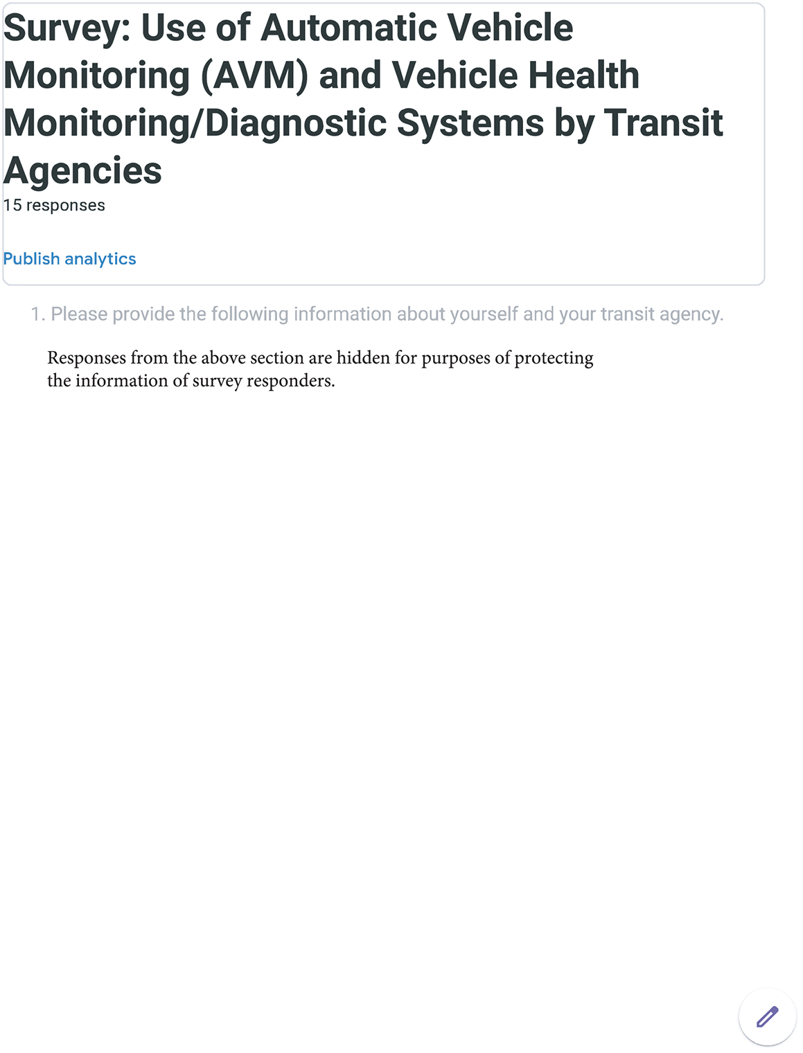
The screenshot is titled 'Use of Automatic Vehicle Monitoring (AVM) and Vehicle Health Monitoring or Diagnostic Systems by Transit Agencies.' It indicates that there are 15 responses collected. Publish analytics is mentioned below the responses. The text then reads "1. Please provide the following information about yourself and your transit agency." Then "Responses from the above section are hidden for purposes of protecting the information of survey responders."
Long Description.
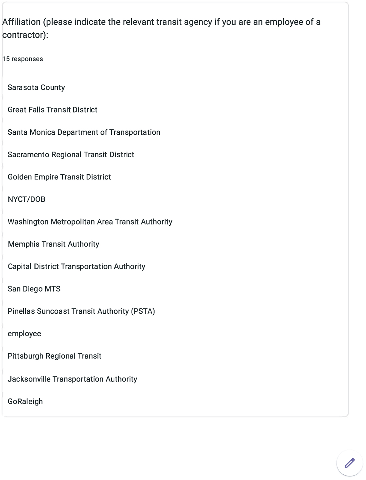
The screenshot begins with a title 'Affiliation (please indicate the relevant transit agency if you are an employee of a contractor)'. It includes 15 responses. The agencies include Sarasota county, Great Falls Transit district, Santa Monica department of transportation, Sacramento Regional Transit district, Golden Empire Transit district, NYCT or DOB, Washington Metropolitan Area Transit Authority, Memphis Transit Authority, Capital District Transportation Authority, San Diego MTS, Pinellas Suncoast Transit Authority (PSTA), employee, Pittsburgh Regional Transit, Jacksonville Transportation Authority, and Go Raleigh.
Long Description.
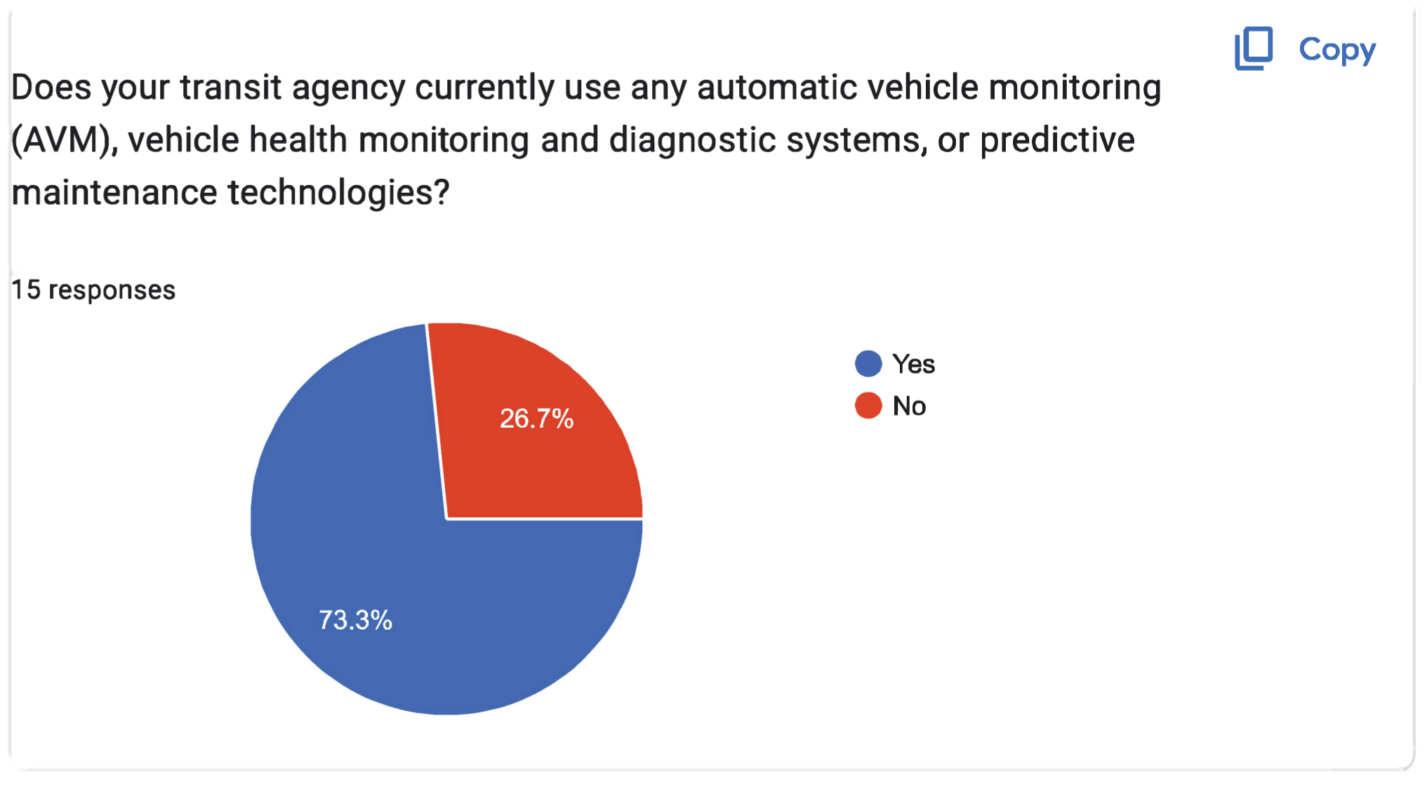
The pie chart is titled 'Does your transit agency currently use any automatic vehicle monitoring (AVM), vehicle health monitoring and diagnostic systems, or predictive maintenance technologies?' The data are Yes: 73.3 percent. No: 26.7 percent. A total of 15 responses are noted.

Long Description.
The pie chart is titled 'Does your transit agency currently use an Automatic Vehicle Monitoring (AVM) system integrated with the Automatic Vehicle Location (AVL) system?' The data given in the pie chart are as follows: Yes: 90.9 percent. No (please skip this section and click 'Next' at the bottom of the page): 9.1 percent. A total of 11 responses are noted. Above the pie chart is the text "3. Automatic Vehicle Monitoring (AVM) System Integrated with the Automatic Vehicle Location (AVL) System"

Long Description.
The pie chart is titled 'Is this system provided by individual component suppliers, or comprehensive systems that are procured separately for maintenance purposes?' The pie chart indicates the following: Blue: provided by individual component suppliers; red: procured separately. Yellow: part of a package. Green: both. Violet: separately initially, but combined after. The data given in percentages is as follows: Blue: 40, Red: 30, Yellow: 10, Green: 10, and Violet: 10.
Long Description.
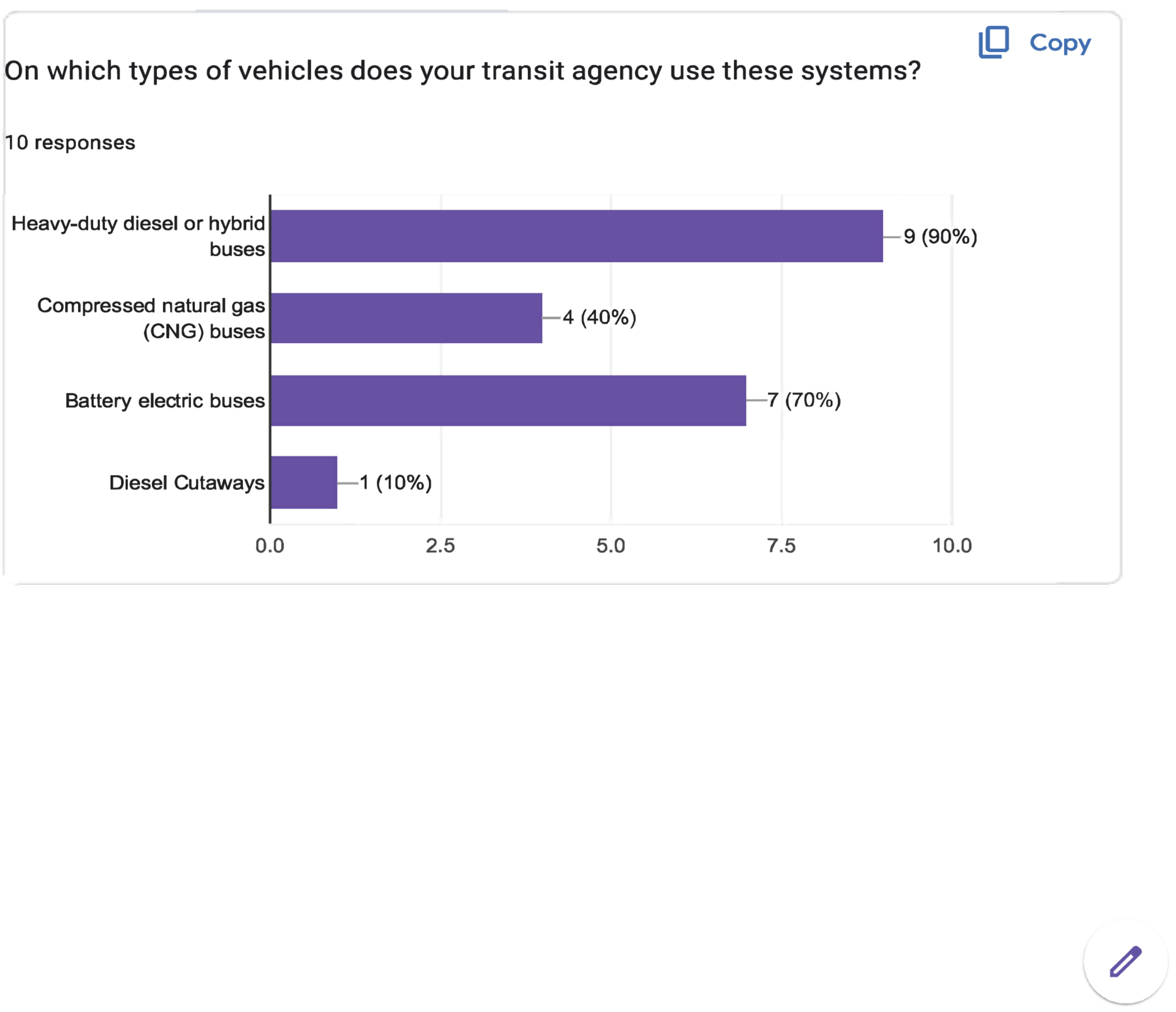
The horizontal axis shows the responses ranging from 0.0 to 10.0 in increments of 2.5 units. The vertical axis displays four types of vehicles. The bar graph shows data for 10 responses on the types of vehicles used in the system. The data presented from the horizontal axis are as follows: Diesel cutaways: 1 (10 percent), battery electric buses: 7 (70 percent), compressed natural gas (CNG) buses: 4 (40 percent), and heavy-duty diesel or hybrid buses: 9 (90 percent).
Long Description.
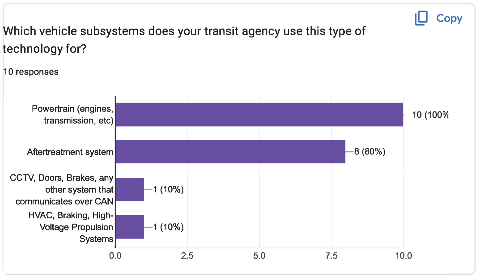
The horizontal axis shows the responses, ranging from 0.0 to 10.0 in increments of 2.5 units. The vertical axis shows four types of vehicle subsystems. The bar graph displays data for 10 responses on the types of vehicle subsystems used by the technology. The data displayed (from the horizontal axis) are as follows: HVAC, braking, and high-voltage propulsion systems: 1 (10 percent); CCTV, doors, brakes, and any other system that communicates over CAN: 1 (10 percent); aftertreatment system: 8 (80 percent); and powertrain (engines, transmission, etc.): 10 (100 percent).

Long Description.
The horizontal axis shows the number of responses, ranging from 0.0 to 10.0 in increments of 2.5 units. The vertical axis shows three functions of the technology. The bar graph displays data for 10 responses on the functions of the technology. The data displayed are as follows: Alarms of faults or critical failures (example, temperature, pressure, etc.) of a vehicle: 10 responses (100 percent); collection and presentation of vehicle or subsystem performance or sensor data: 9 responses (90 percent); and prediction of likely failures: 5 responses (50 percent).

Long Description.
The horizontal axis shows the number of responses, ranging from 0.0 to 10.0 in increments of 2.5 units. The vertical axis displays the time frames in which the collected information is made available. The bar graph displays data for 10 responses on the information collected by the technology made available to the technicians. The data displayed are as follows: The information is provided in real-time: 9 responses (90 percent); The information is available a day after collection: 3 responses (30 percent); The information is available two days after collection: 1 response (10 percent).
Long Description.
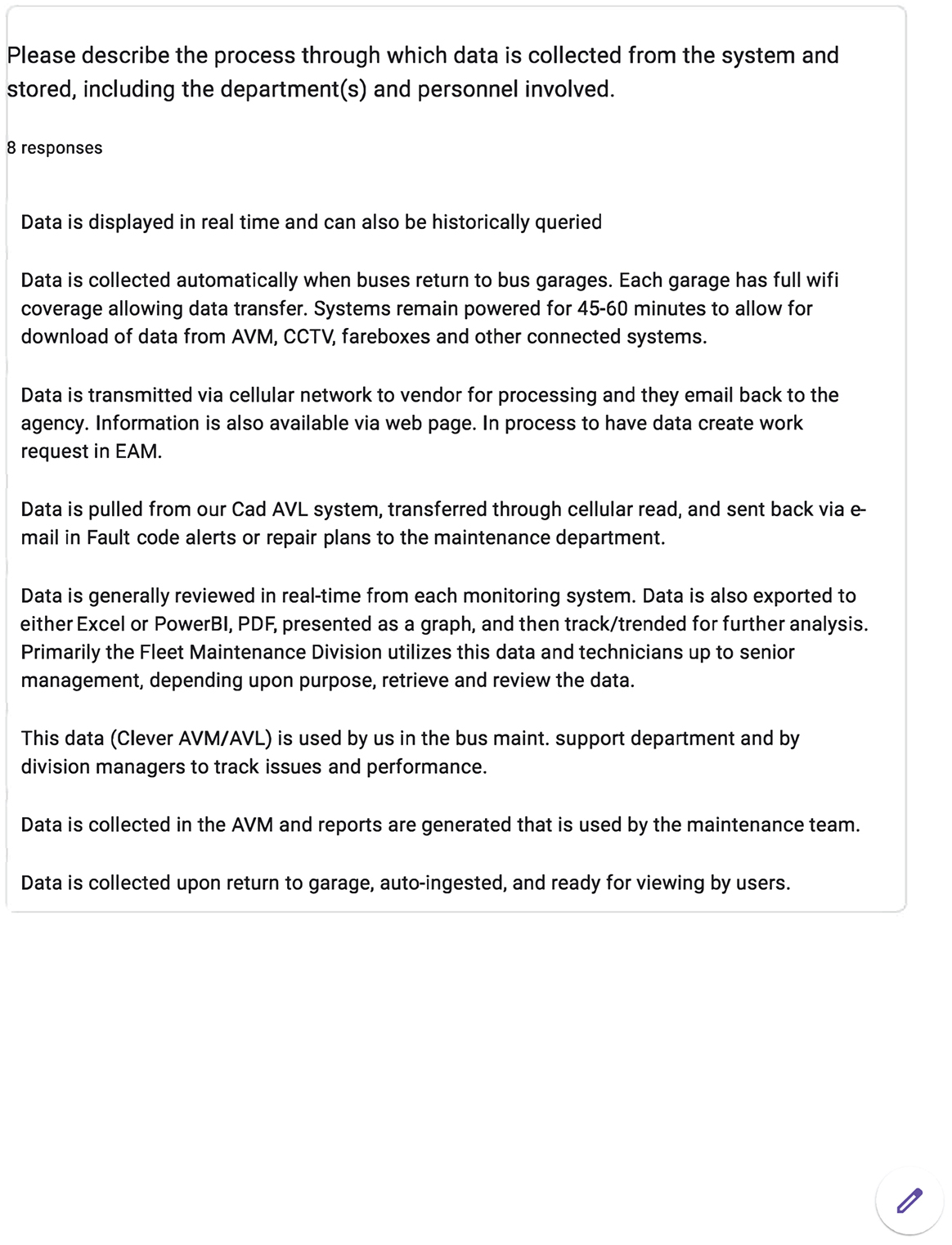
The screenshot is titled 'Please describe the process through which data is collected from the system and stored, including the department(s) and personnel involved.' It includes 8 responses and lists the following: Data is displayed in real time and can also be historically queried. Data is collected automatically when buses return to the bus garages. Each garage has full Wi-Fi coverage, allowing data transfer. Systems remain powered for 45-60 minutes to allow for the download of data from AVM, CCTV, fareboxes, and other connected systems. Data is transmitted via cellular network to the vendor for processing, and they email it back to the agency. Information is also available via a web page. In the process of having data work requests in EAM. Data is pulled from our Cad AVL system, transferred through cellular read, and sent back via email in Fault code alerts or repair plans to the maintenance department. Data is generally reviewed in real-time from each monitoring system. Data is also exported to either Excel or Power BI, PDF, presented as a graph, and then tracked or trended for further analysis. Primarily, the Fleet Maintenance Division utilizes this data and technicians up to senior management, depending upon purpose, retrieve and review the data. This data (Clever AVM or AVL) is used by us in the bus maintenance. Support the department and by division managers to track issues and performance. Data is collected in the AVM and reports are generated that are used by the maintenance team. Data is collected upon return to the garage, auto-ingested, and ready for viewing by users.
Long Description.
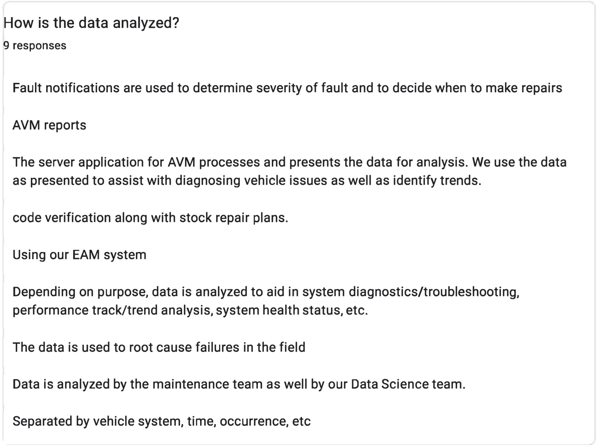
The screenshot has nine responses, including that fault notifications are used to determine the severity of the fault and to decide when to make repairs, AVM. The server application for AVM processes and presents the data for analysis. We use the data as presented to assist with diagnosing vehicle issues as well as identifying trends. Code verification along with stock repair plans. Using our EAM system. Depending on the purpose, data is analyzed to aid in system diagnostics or troubleshooting, performance tracking or trend analysis, system health status, etc. The data is used to root cause failures in the field. Data is analyzed by the maintenance team as well as by our Data Science team. Separated by vehicle system, time, occurrence, etc.

Long Description.
The screenshot is titled '4. Comprehensive Vehicle Monitoring, Diagnostic, and Reporting System Integrated with the Maintenance System.' The pie chart begins with a question 'Does your transit agency currently use a comprehensive vehicle monitoring, diagnostic, and reporting system integrated with the maintenance system?' The data given in the pie chart are as follows: Yes: 36.4 percent. No (please skip this section and click 'Next' at the bottom of the page): 63.6 percent. A total of 11 responses are noted.
Long Description.
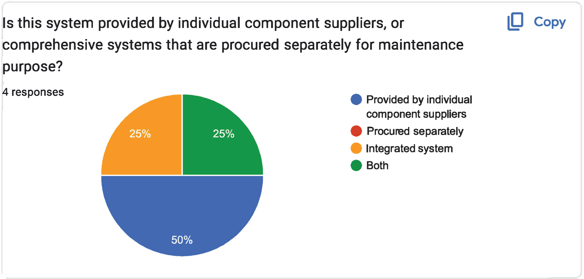
The pie chart titled 'Is this system provided by individual component suppliers, or comprehensive systems that are procured separately for maintenance purposes?' A key to the right indicates the following: Blue: Provided by individual component supplier. Red: Procured separately. Yellow: Integrated system. Green: Both. The pie chart is divided into three sections with the data given in percentages is as follows: Blue: 50, Yellow: 25, Green: 25.
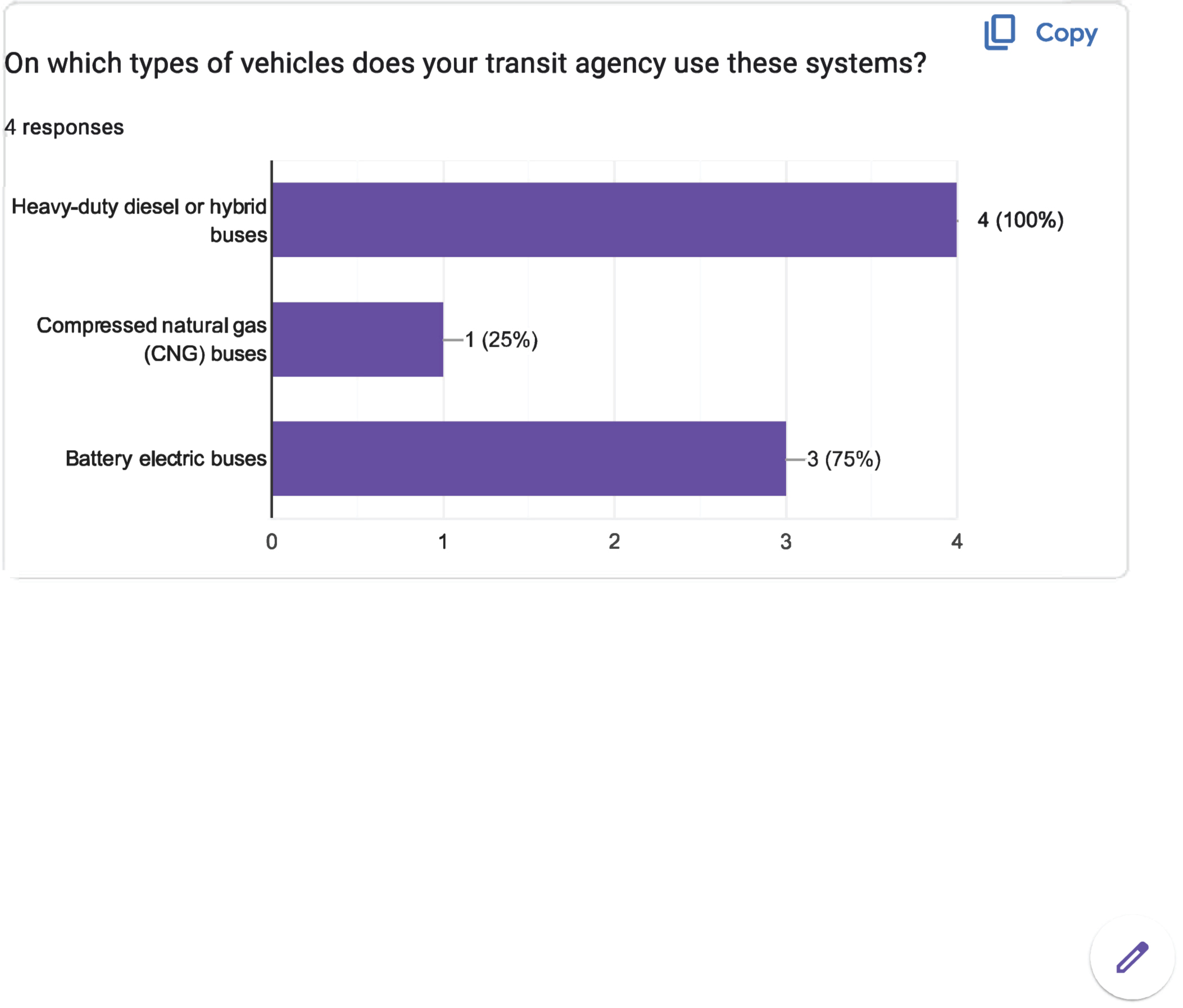
Long Description.
The horizontal axis shows the number of responses, ranging from 0 to 4 in increments of 1 unit. The vertical axis shows different types of buses. The bar graph shows data for 4 responses on the types of vehicles used in the system. The data displayed are as follows: Battery electric buses: 3 responses (75 percent). Compressed natural gas (CNG) buses: 1 response (25 percent). Heavy-duty diesel or hybrid buses: 4 responses (100 percent).
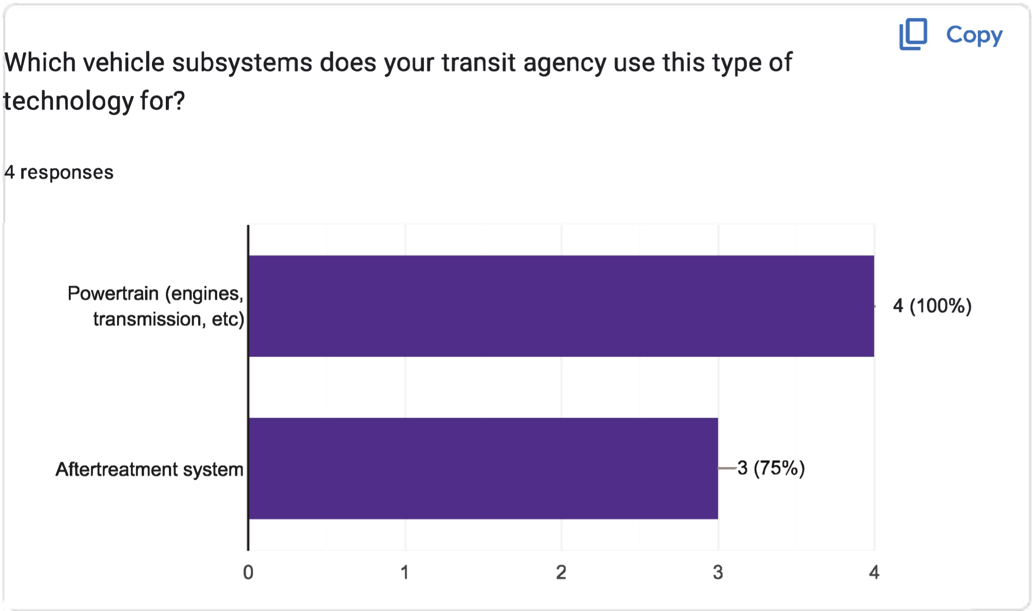
Long Description.
The horizontal axis shows the number of responses, ranging from 0 to 4 in increments of 1 unit. The vertical axis represents two types of vehicle subsystems. The bar graph displays data for 4 responses on the types of vehicle subsystems used by the technology. The data displayed are as follows: Aftertreatment system: 3 responses (75 percent). Powertrain (engines, transmission, etc.): 4 responses (100 percent).
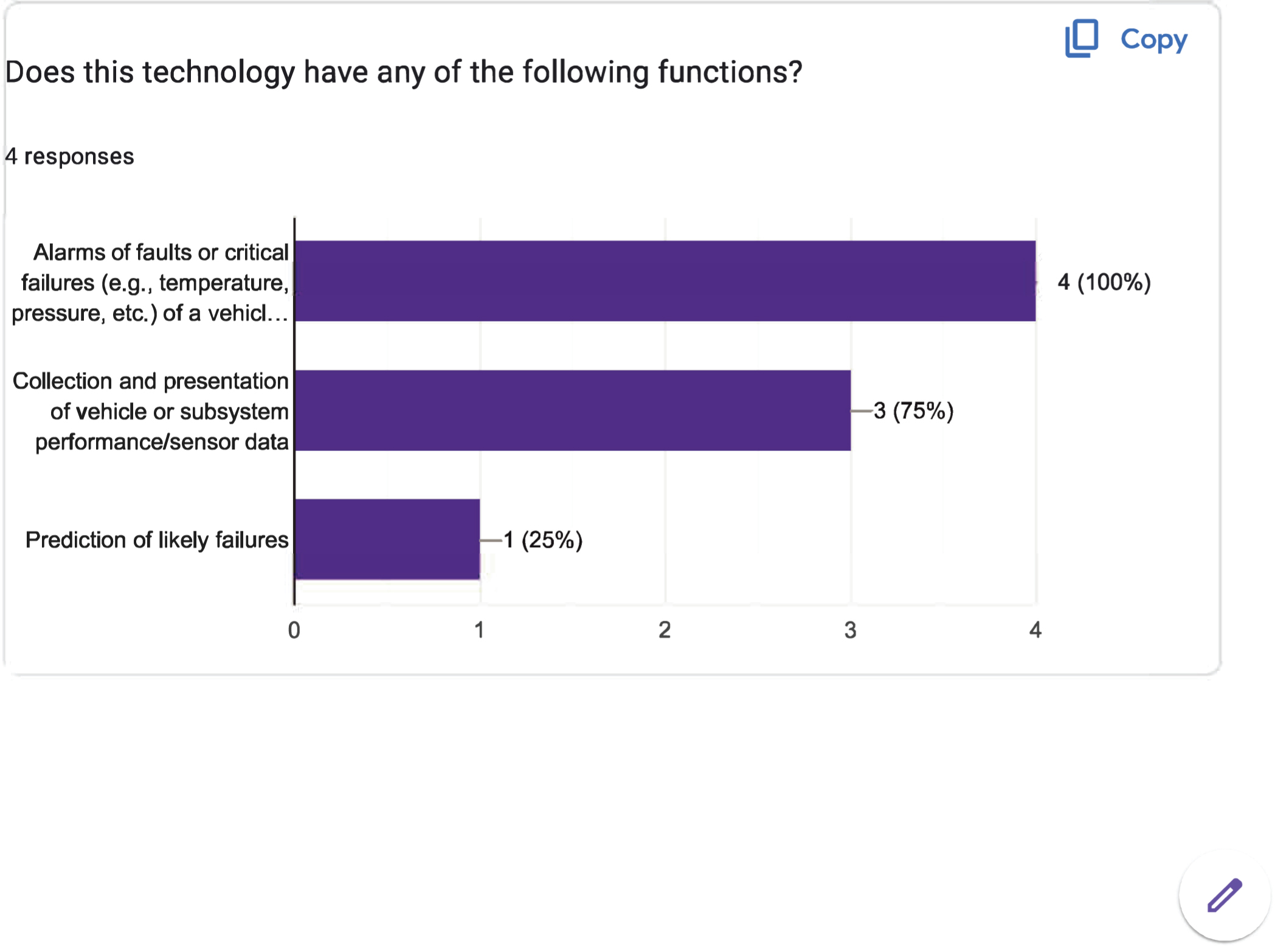
Long Description.
The horizontal axis shows the number of responses, ranging from 0 to 4 in increments of 1 unit. The vertical axis displays three functions. The bar graph displays data for 4 responses on the functions of the technology. The data displayed are as follows: Alarms of faults or critical failures (for example, temperature, pressure, etc.): 4 responses (100 percent). Collection and presentation of vehicle or subsystem performance or sensor data: 3 responses (75 percent). Prediction of likely failures: 1 response (25 percent).
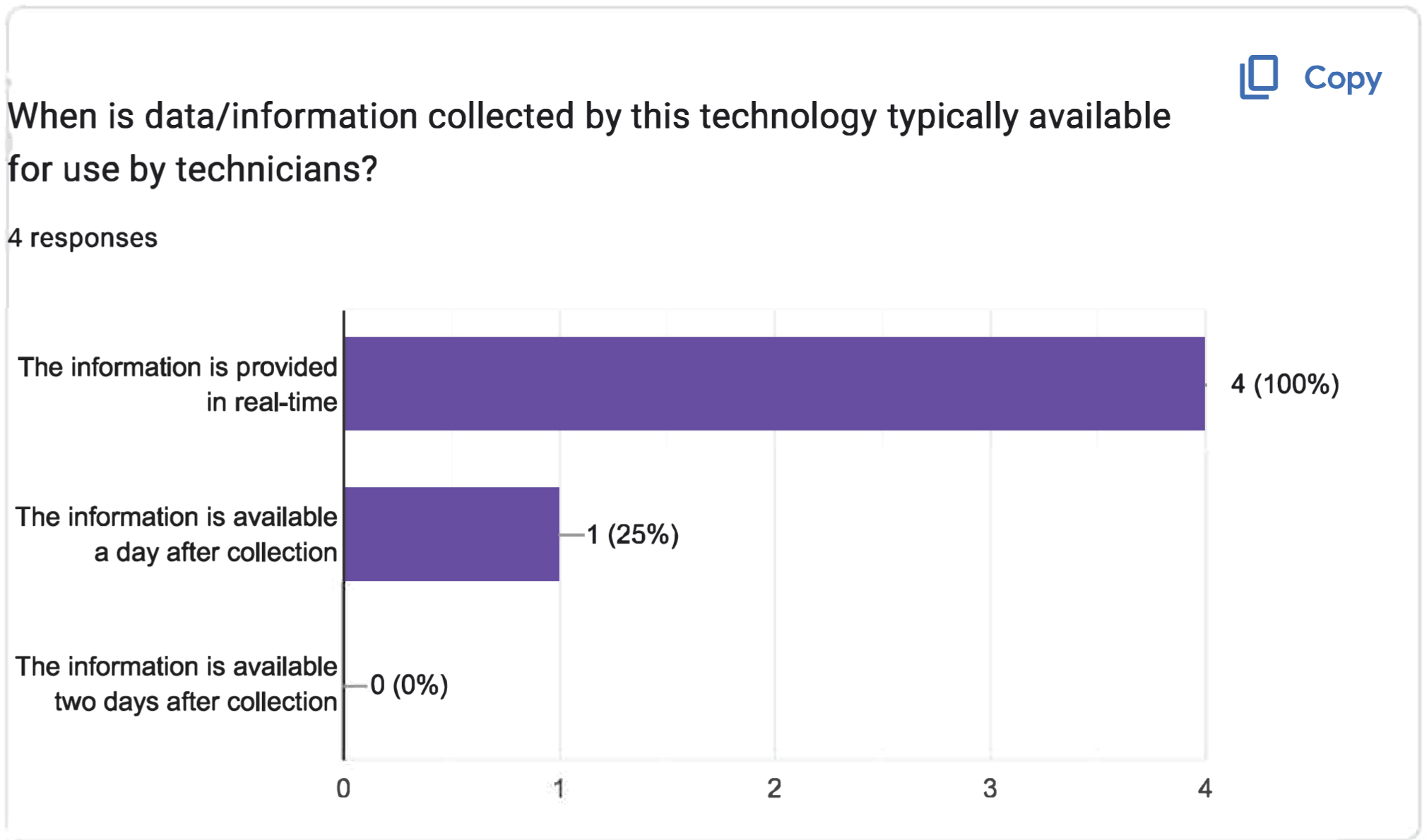
Long Description.
The horizontal axis shows the number of responses, ranging from 0 to 4 in increments of 1 unit. The vertical axis represents the timing of information availability. The bar graph displays data for 4 responses on the information collected by the technology made available to the technicians. The data displayed are as follows: The information is provided in real-time: 4 responses (100 percent). The information is available a day after collection: 1 response (25 percent). The information is available two days after collection: 0 responses (0 percent).
Long Description.
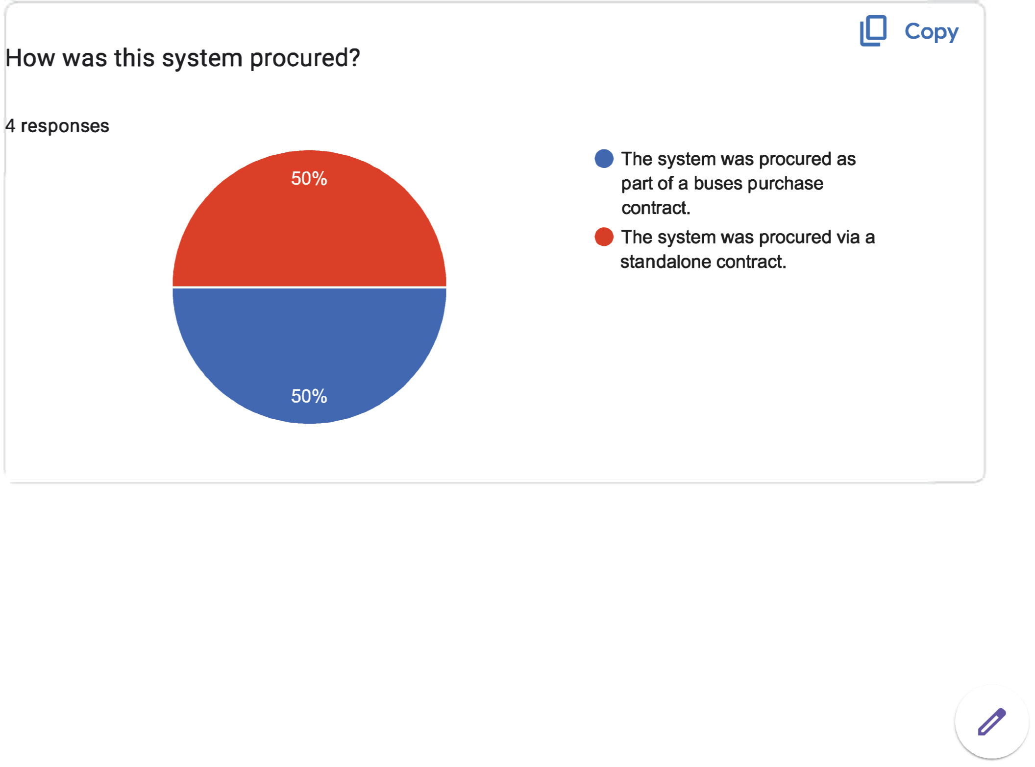
The pie chart displays four responses. The pie chart is divided into two sections representing the following: The system that was procured as part of the buses purchase contract (blue) and the system that was procured via a standalone contract (red). The data shown are as follows: Blue: 50 percent. Red: 50 percent.
Long Description.
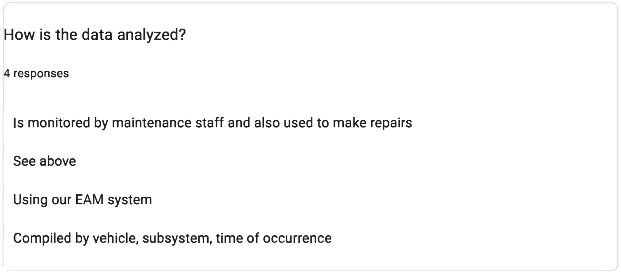
The screenshot is followed by four responses. The responses include: Is monitored by maintenance staff and also used to make repairs. See above. Using our EAM system. Compiled by vehicle, subsystem, and time of occurrence.
Long Description.
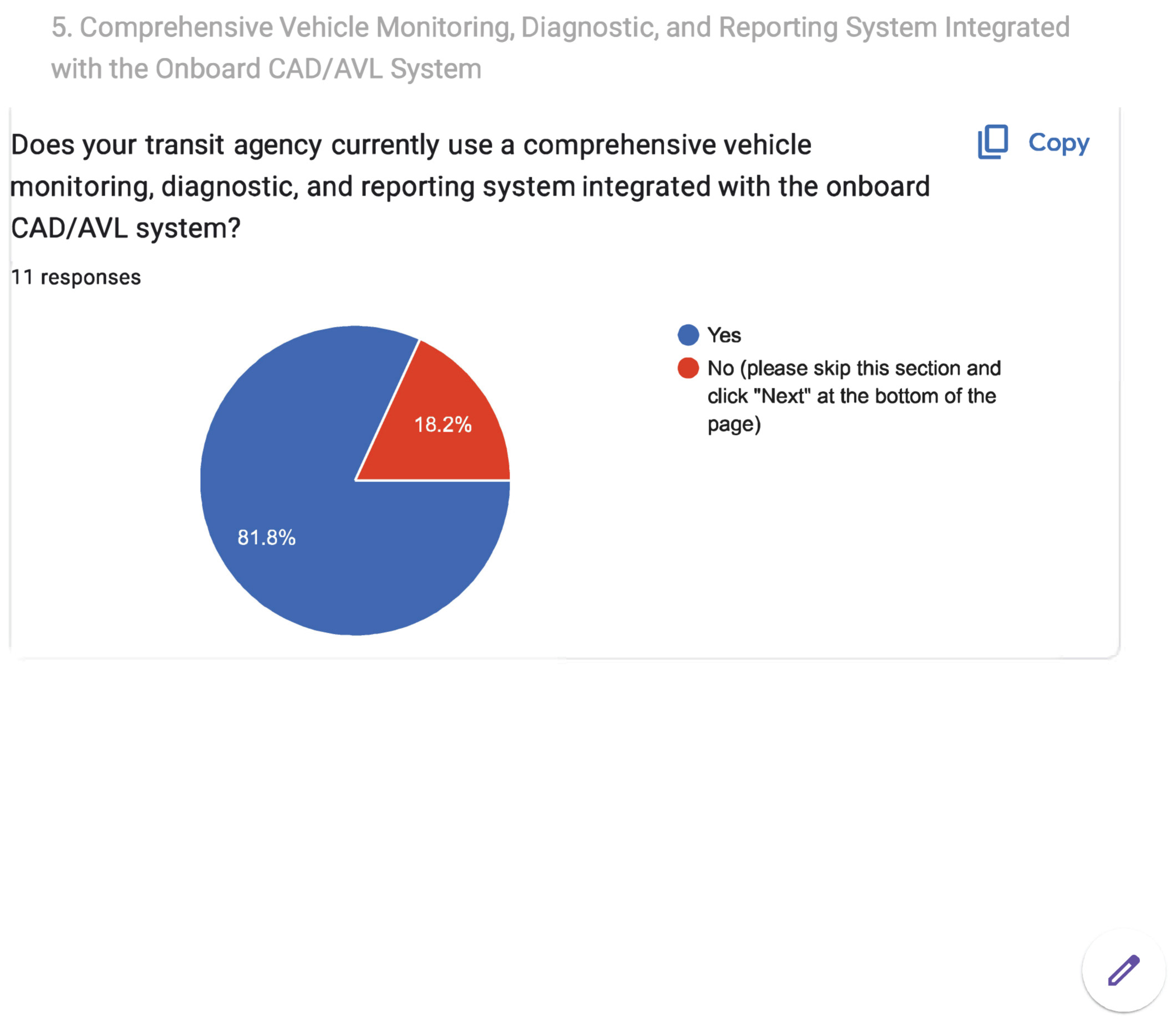
The pie chart is titled '5. Comprehensive Vehicle Monitoring, Diagnostic, and Reporting System Integrated with the onboard CAD or AVL System.' The pie chart begins with the question 'Does your transit agency currently use a comprehensive vehicle monitoring, diagnostic, and reporting system integrated with the onboard CAD or AVL system?' The data given in the pie chart are as follows: Yes: 81.8 percent. No (please skip this section and click 'Next' at the bottom of the page): 18.2 percent. A total of 11 responses are noted.
Long Description.
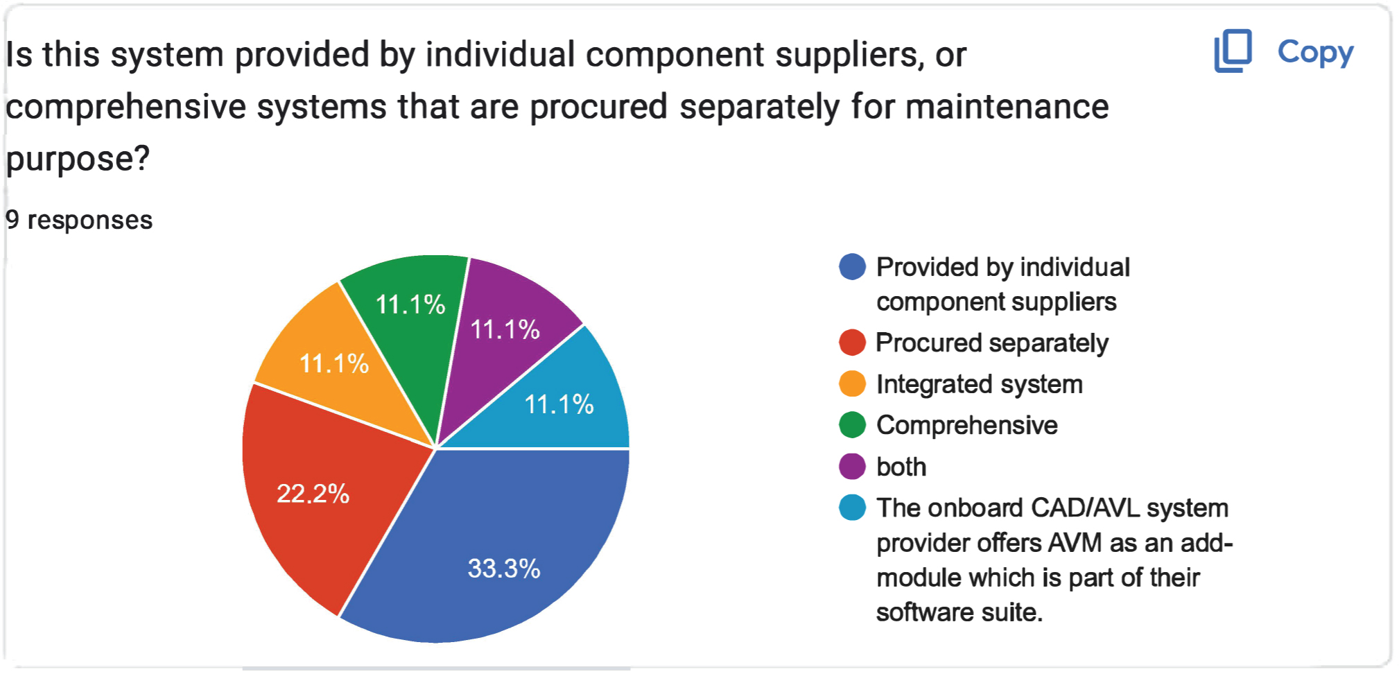
The pie chart is titled 'Is this system provided by individual component suppliers, or comprehensive systems that are procured separately for maintenance purposes?' The pie chart is divided into six sections, each indicating the following: Blue: provided by individual component suppliers. Red: procured separately. Yellow: integrated system. Green: comprehensive. Violet: Both. Sky blue: The onboard CAD or AVL system provider offers AVM as an add-on module, which is part of their software suite. The data given in percentages is as follows: Blue: 33.3, Red: 22.2, Yellow: 11.1, Green: 11.1, Violet: 11.1, and Sky blue: 11.1.
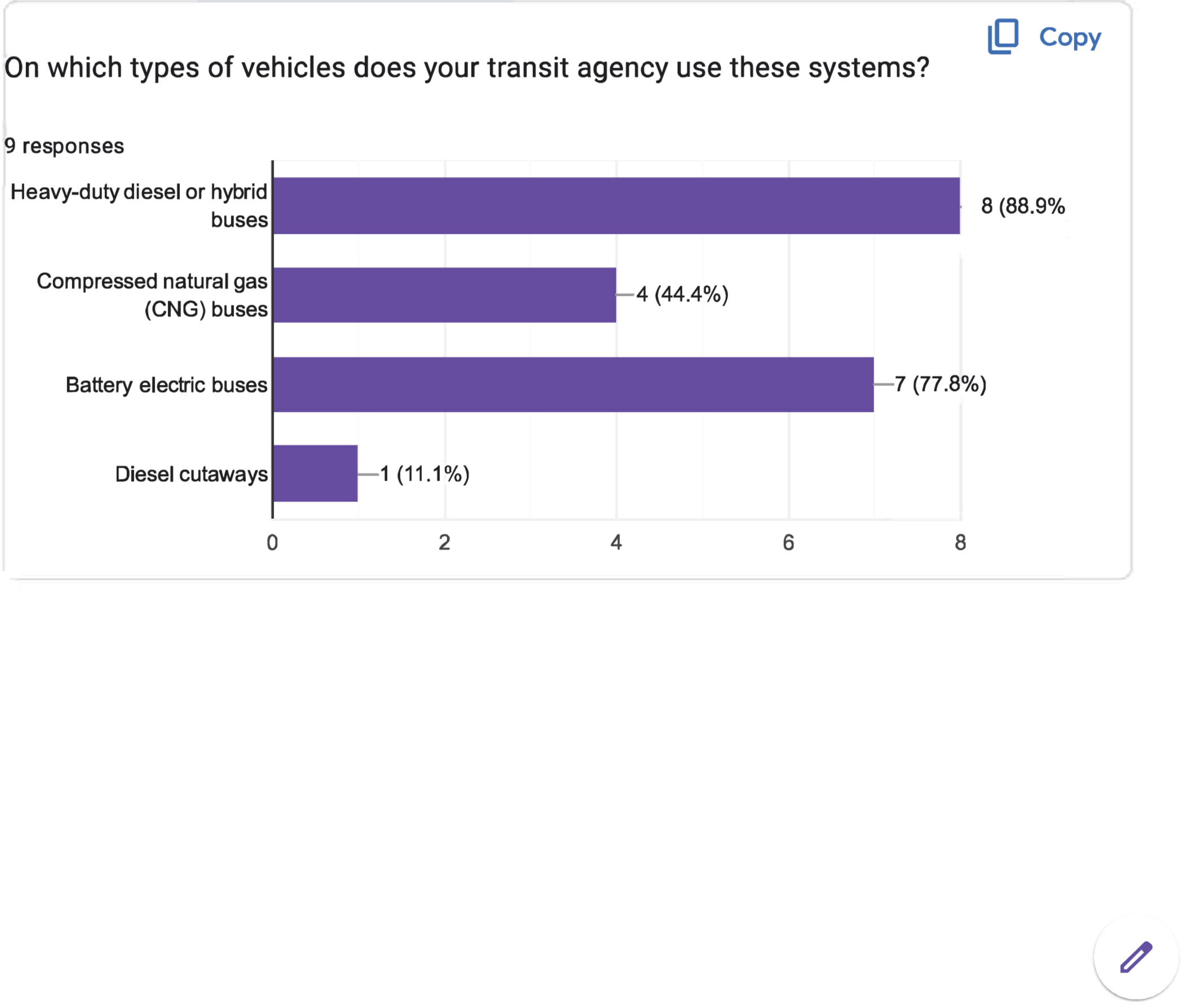
Long Description.
The horizontal axis shows the number of responses, ranging from 0 to 8 in increments of 2 units. The vertical axis lists four types of buses. The bar graph shows the types of vehicles used in the systems for 9 responses. The data displayed are as follows: Heavy-duty diesel or hybrid buses: 8 responses (88.9 percent). Battery electric buses: 7 responses (77.8 percent). Compressed natural gas (CNG) buses: 4 responses (44.4 percent). Diesel cutaways: 1 response (11.1 percent).
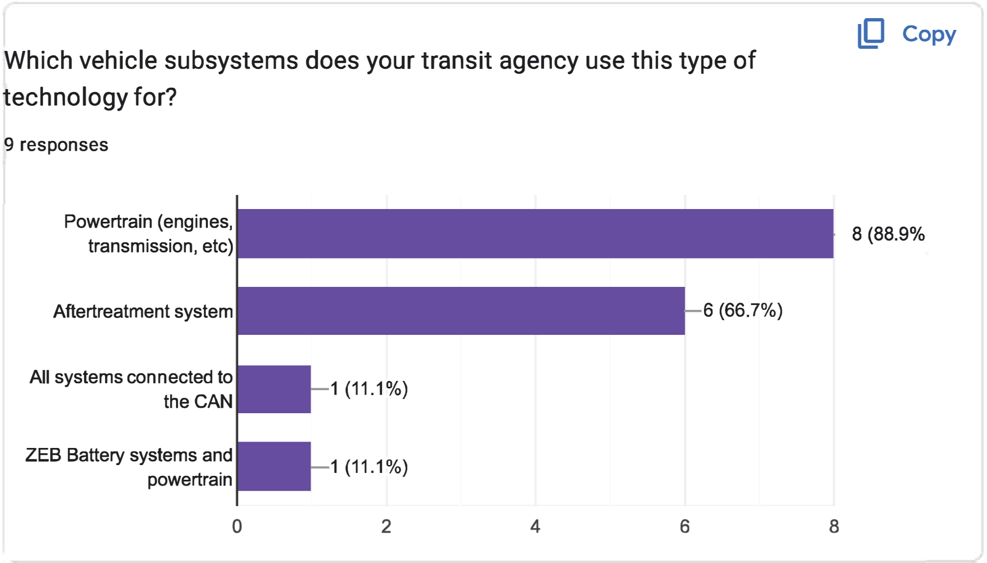
Long Description.
The horizontal axis shows the number of responses, ranging from 0 to 8 in increments of 2 units. The vertical axis shows various vehicle subsystems. The bar graph displays data for 4 responses on the types of vehicle subsystems used by the technology. The data displayed are as follows: Powertrain (engines, transmission, etc.): 8 responses (88.9 percent). Aftertreatment system: 6 responses (66.7 percent). All systems connected to the CAN: 1 response (11.1 percent). ZEB battery systems and powertrain: 1 response (11.1 percent).

Long Description.
The horizontal axis shows the number of responses, ranging from 0.0 to 10.0 in increments of 2.5 units. The vertical axis displays three functions. The bar graph displays data for 9 responses on the functions of the technology. The data displayed are as follows: Alarms of faults or critical failures (for example, temperature, pressure, etc.): 9 responses (100 percent). Collection and presentation of vehicle or subsystem performance or sensor data: 7 responses (77.8 percent). Prediction of likely failures: 3 responses (33.3 percent).
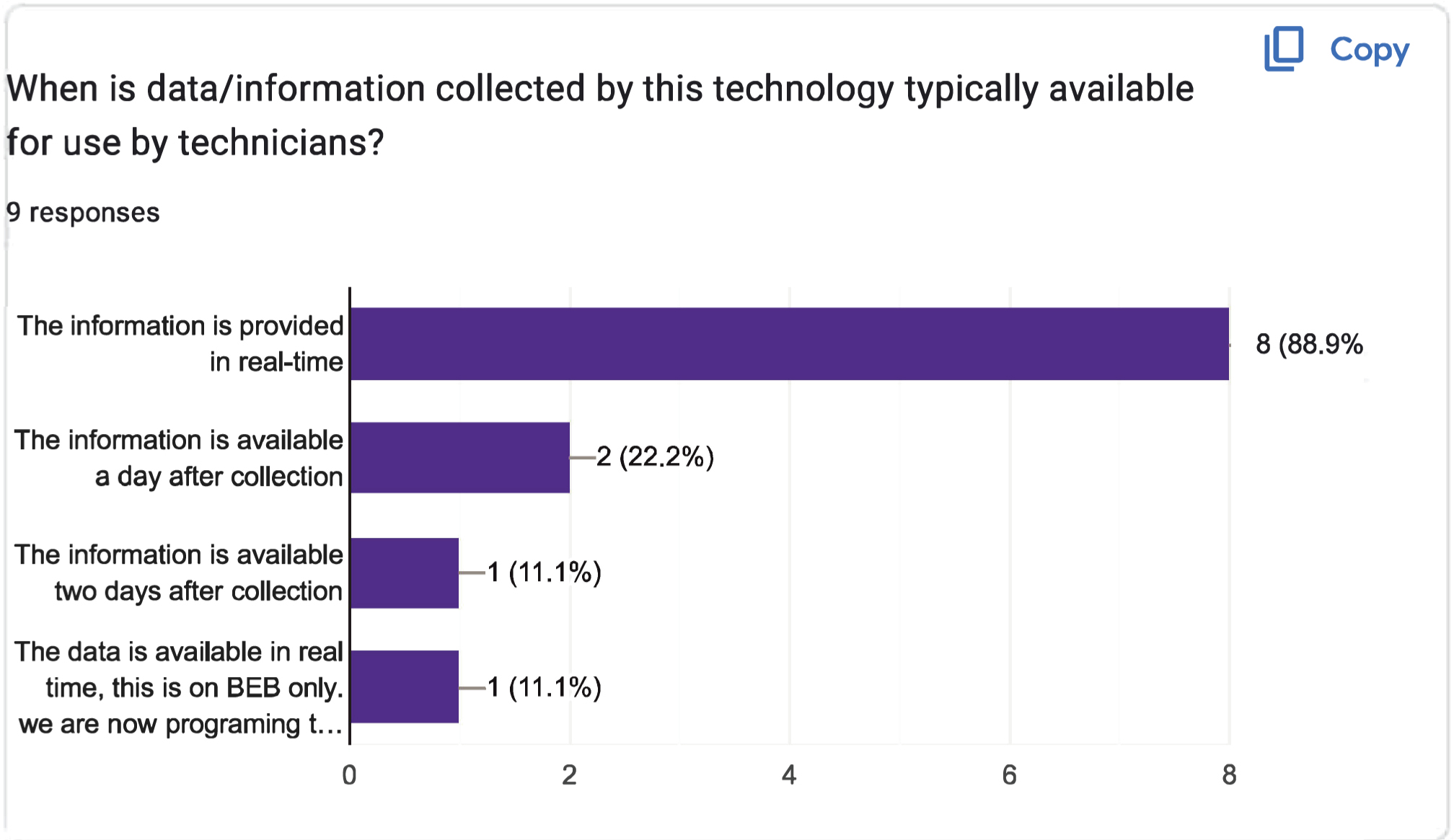
Long Description.
The horizontal axis shows the number of responses, ranging from 0 to 8 in increments of 2 units. The vertical axis represents the timing of information availability. The bar graph displays data for 9 responses on the information collected by the technology made available to the technicians. The data displayed are as follows: The information is provided in real-time: 8 responses (88.9 percent). The information is available a day after collection: 2 reponses (22.2 percent). The information is available two days after collection: 1 response (11.1 percent). The information is provided in real-time, this is on BEB only: 1 response (11.1 percent).
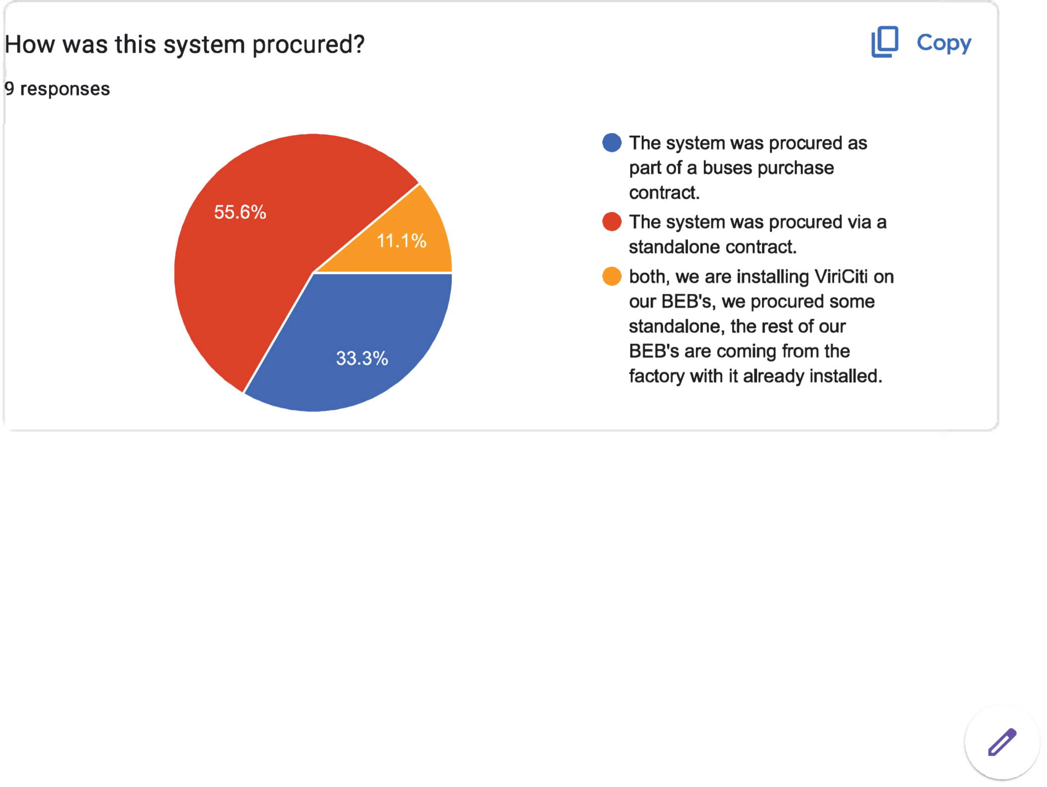
Long Description.
The pie chart displays nine responses. The pie chart is divided into three sections representing the following: Blue for The system that was procured as part of the buses purchase contract; Red for the system that was procured via a standalone contract, and Yellow for both, we are installing ViriCiti on our BEB's, we procured some standalone, the rest of our BEB's are coming from the factory with it already installed. The data shown in percentages is as follows: Blue: 33.3; Red: 55.6; Yellow: 11.1.
Long Description.
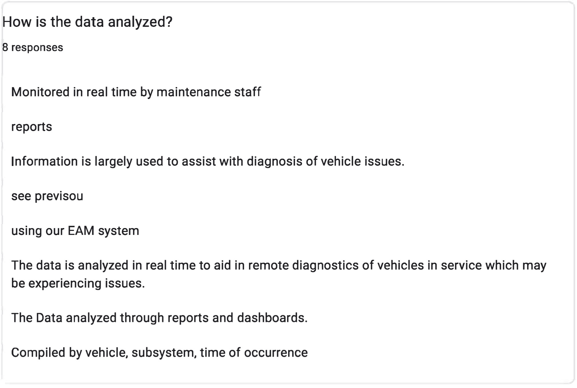
The screenshot shows nine responses. The responses include Monitored in real-time by maintenance staff, Using reports, Information is largely used to assist with diagnosis of vehicle issues, Using our the EAM system, The data is primarily used for diagnosing vehicle issues, The data analyzed through reports and dashboards, and Compiled by vehicle, subsystem, and time of occurrence.
Long Description.
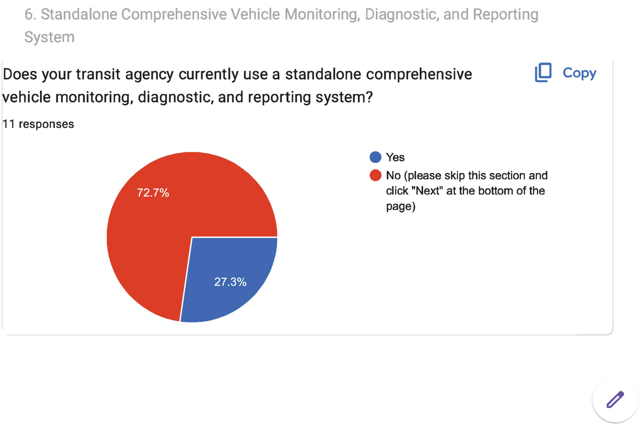
The pie chart begins with a question 'Does your transit agency currently use a standalone comprehensive vehicle monitoring, diagnostic, and reporting system?' The data given in the pie chart are as follows: Yes: 27.3 percent. No (please skip this section and click 'Next' at the bottom of the page): 72.7 percent. A total of 11 responses are noted.
Long Description.
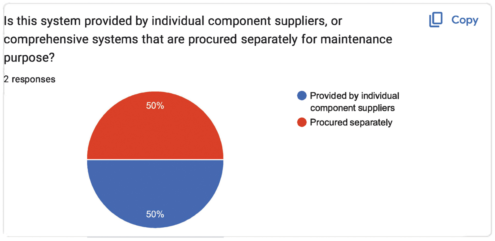
The pie chart begins with a question 'Is this system provided by individual component suppliers, or comprehensive systems that are procured separately for maintenance purposes?' The data given in the pie chart are as follows: Yes: 50 percent. No (please skip this section and click 'Next' at the bottom of the page): 50 percent. A total of 2 responses are noted.
Long Description.
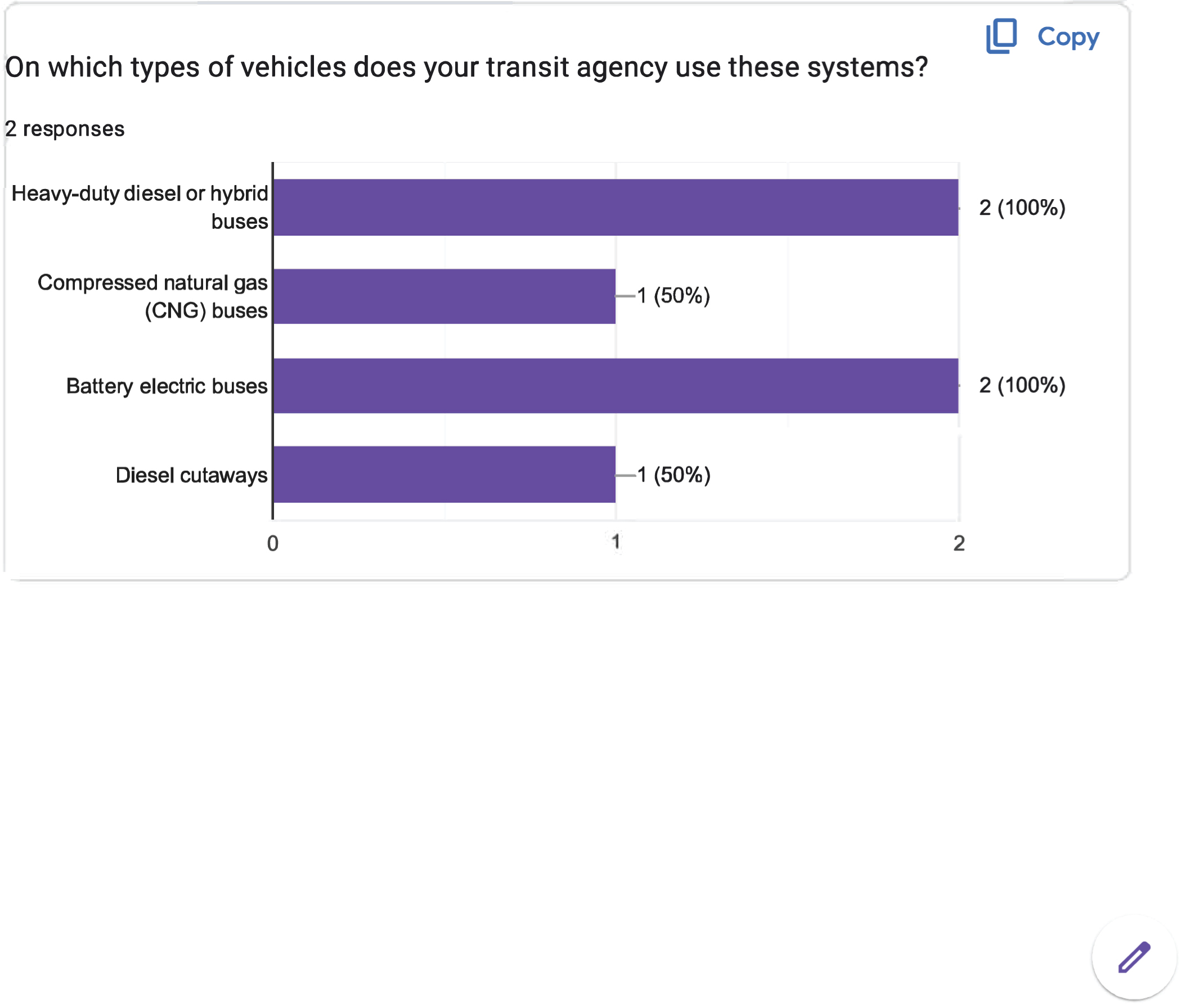
The horizontal axis shows the number of responses, ranging from 0 to 2 in increments of 1 unit. The vertical axis lists four types of buses. The bar graph shows the types of vehicles used in the systems for the 2 responses. The data displayed are as follows: Heavy-duty diesel or hybrid buses: 2 responses (100 percent). Compressed natural gas (CNG) buses: 1 response (50 percent). Battery electric buses: 2 responses (100 percent). Diesel cutaways: 1 response (50 percent).
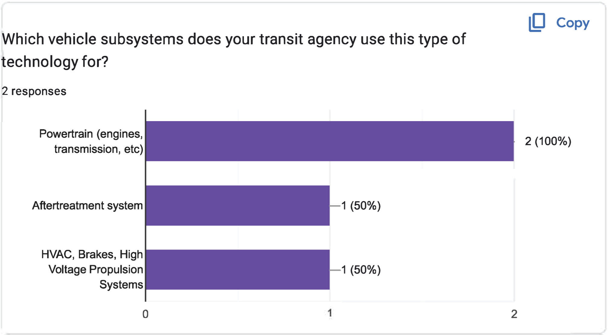
Long Description.
The horizontal axis shows the number of responses, ranging from 0 to 2 in increments of 1 unit. The vertical axis shows various vehicle subsystems. The bar graph displays data for 2 responses on the types of vehicle subsystems used by the technology. The data displayed are as follows: Powertrain (engines, transmission, etc.): 2 responses (100 percent). Aftertreatment system: 1 response (50 percent). HVAC, Brakes, High Voltage Propulsion Systems: 1 response (50 percent).
Long Description.
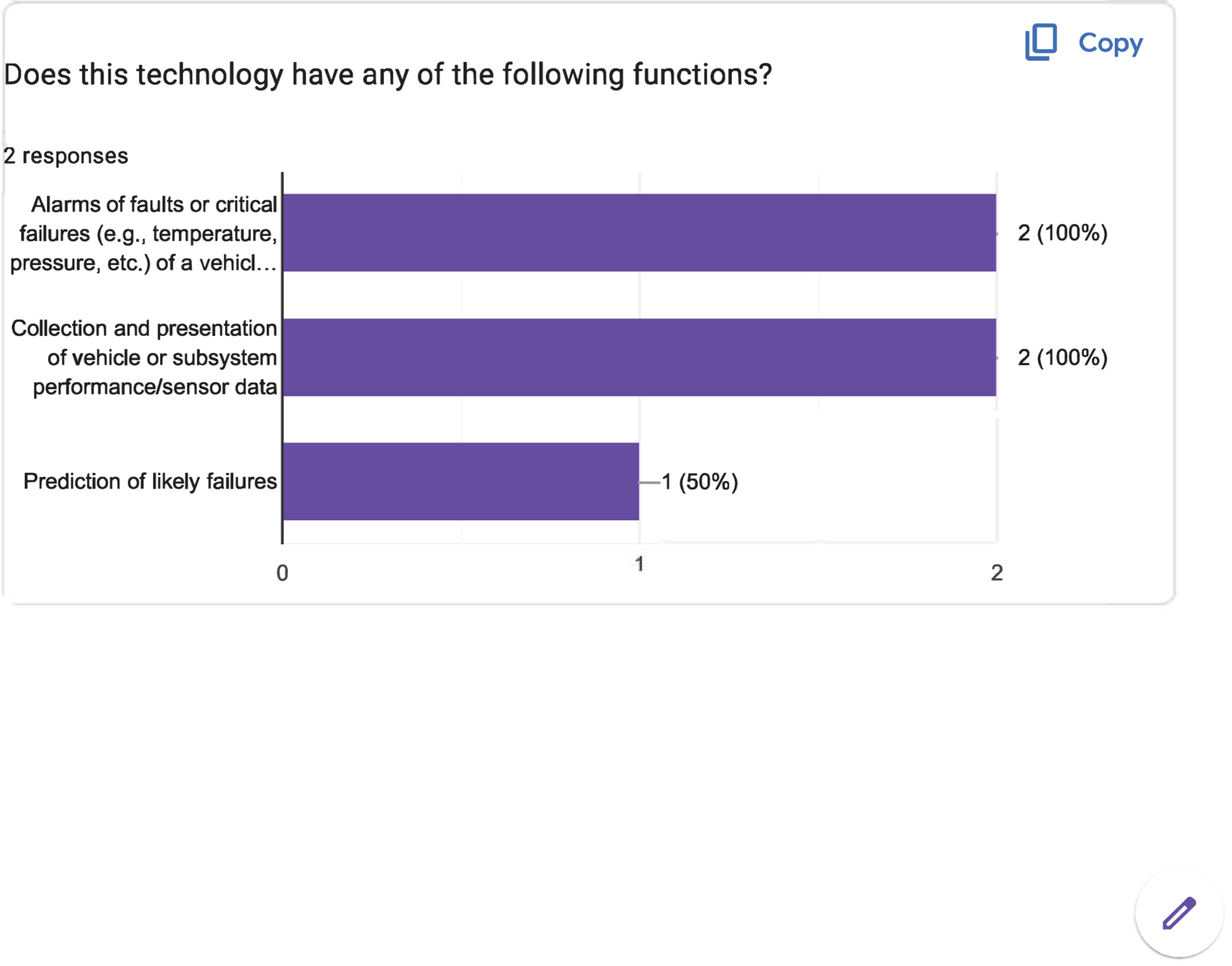
The horizontal axis shows the number of responses, ranging from 0 to 2 in increments of 1 unit. The vertical axis displays three functions. The bar graph displays data for 2 responses on the functions of the technology. The data displayed are as follows: Alarms of faults or critical failures (for example, temperature, pressure, etc.) of a vehicle: 2 responses (100 percent). Collection and presentation of vehicle or subsystem performance or sensor data: 2 responses (100 percent). Prediction of likely failures: 1 response (50 percent).
Long Description.
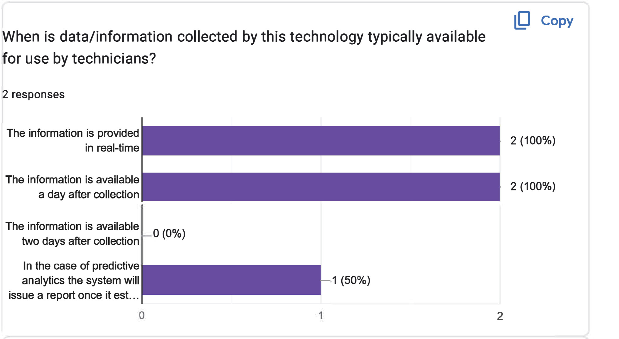
The horizontal axis shows the number of responses, ranging from 0 to 2 in increments of 1 unit. The vertical axis represents the timing of information availability. The bar graph displays data for 2 responses on the information collected by the technology made available for the technicians. The data displayed are as follows: The information is provided in real-time: 2 responses (100 percent). The information is available a day after collection: 2 responses (100 percent). The information is available two days after collection: 0 responses (0 percent). In the case of predictive analytics, the system will issue a report once it has estimated: 1 response (50 percent).
Long Description.
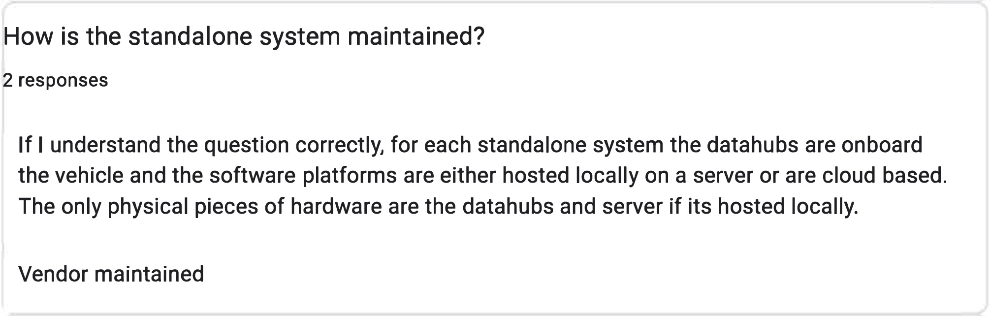
Two responses are noted. The first response is: If I understand the question correctly, for each standalone system, the data hubs are onboard the vehicle, and the software platforms are either hosted locally on a server or are cloud-based. The only physical pieces of hardware are the data hubs and the server, if it's hosted locally. The second response is: Vendor maintained.
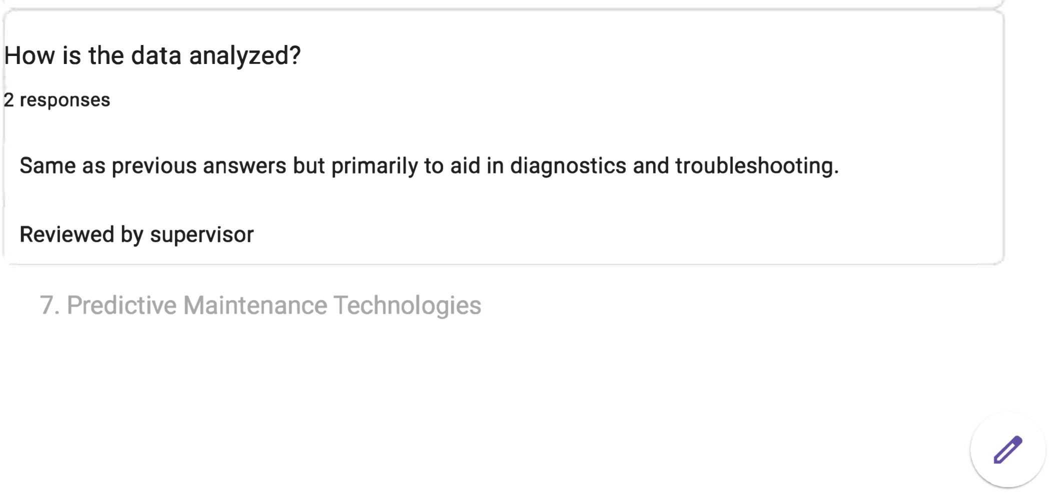
Long Description.
Two responses are noted. The first response states that the data analysis is similar to previous answers but focuses on aiding in diagnostics and troubleshooting. The second response indicates that the analysis is reviewed by a supervisor. Under this is the text "7. Predictive maintenance technologies"
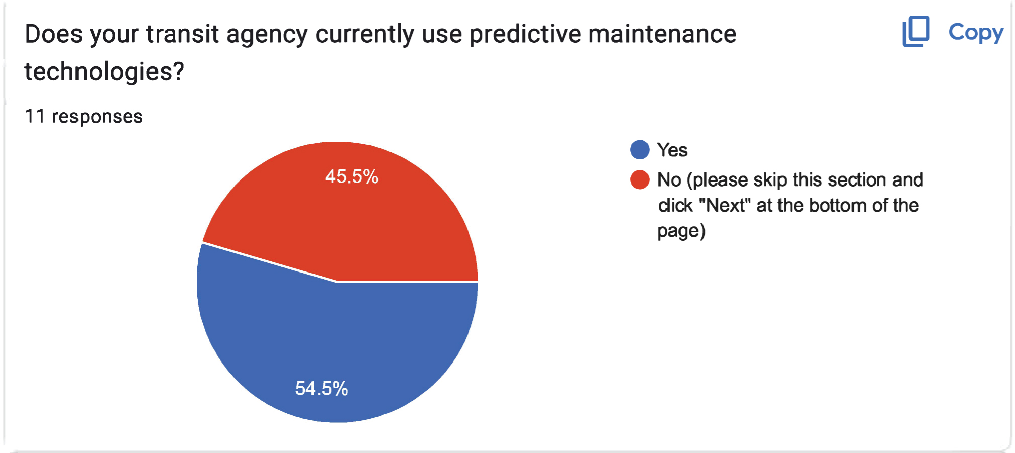
Long Description.
The data given in the pie chart are as follows: Yes: 54.5 percent. No (please skip this section and click 'Next' at the bottom of the page): 45.4 percent. A total of 11 responses are noted.
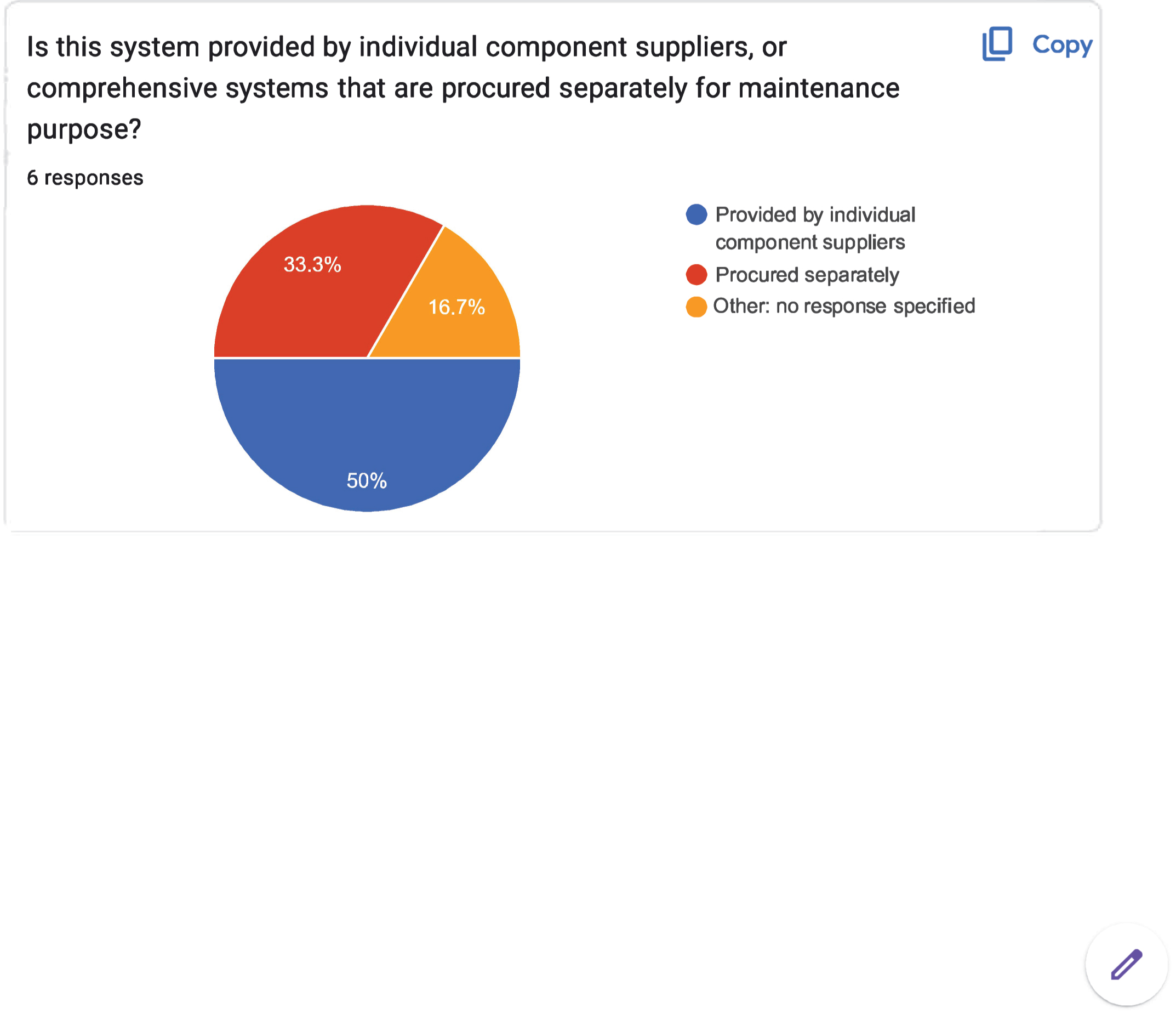
Long Description.
The pie chart is titled 'Is this system provided by individual component suppliers, or comprehensive systems that are procured separately for maintenance purposes?' The pie chart contains 6 responses. The sections in the pie chart represent: Provided by individual component suppliers in blue, Procured separately in red, and Other: no response specified in yellow. The data shown are as follows: Blue: 50 percent. Red: 33.3 percent. Yellow: 16.7 percent.
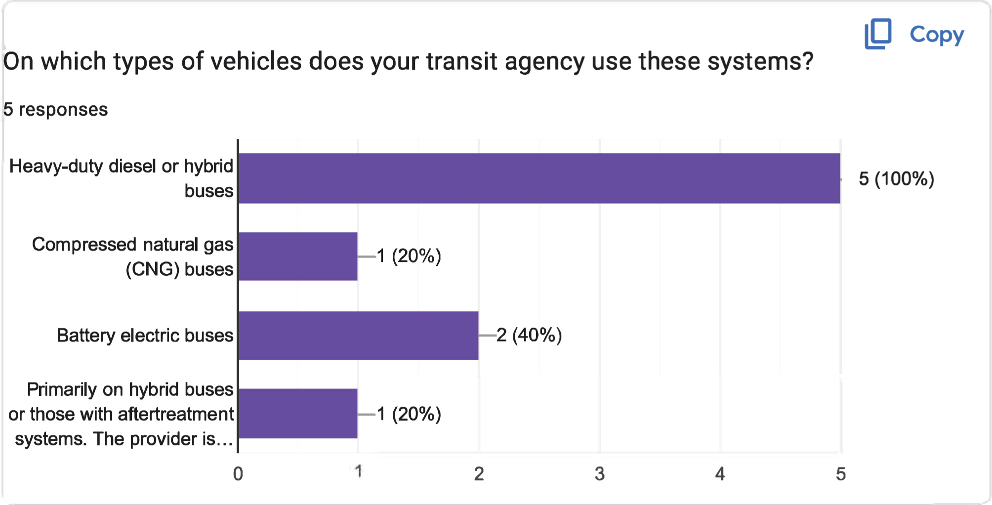
Long Description.
The horizontal axis shows the number of responses, ranging from 0 to 5 in increments of 1 unit. The vertical axis lists four types of buses. The bar graph shows the types of vehicles used in the systems for the 5 responses. The data displayed (from the top) are as follows: Heavy-duty diesel or hybrid buses: 5 responses (100 percent). Compressed natural gas (CNG) buses: 1 response (20 percent). Battery electric buses: 2 responses (40 percent). Primarily on hybrid buses or those with aftertreatment systems. The provider is...: 1 response (20 percent).
Long Description.
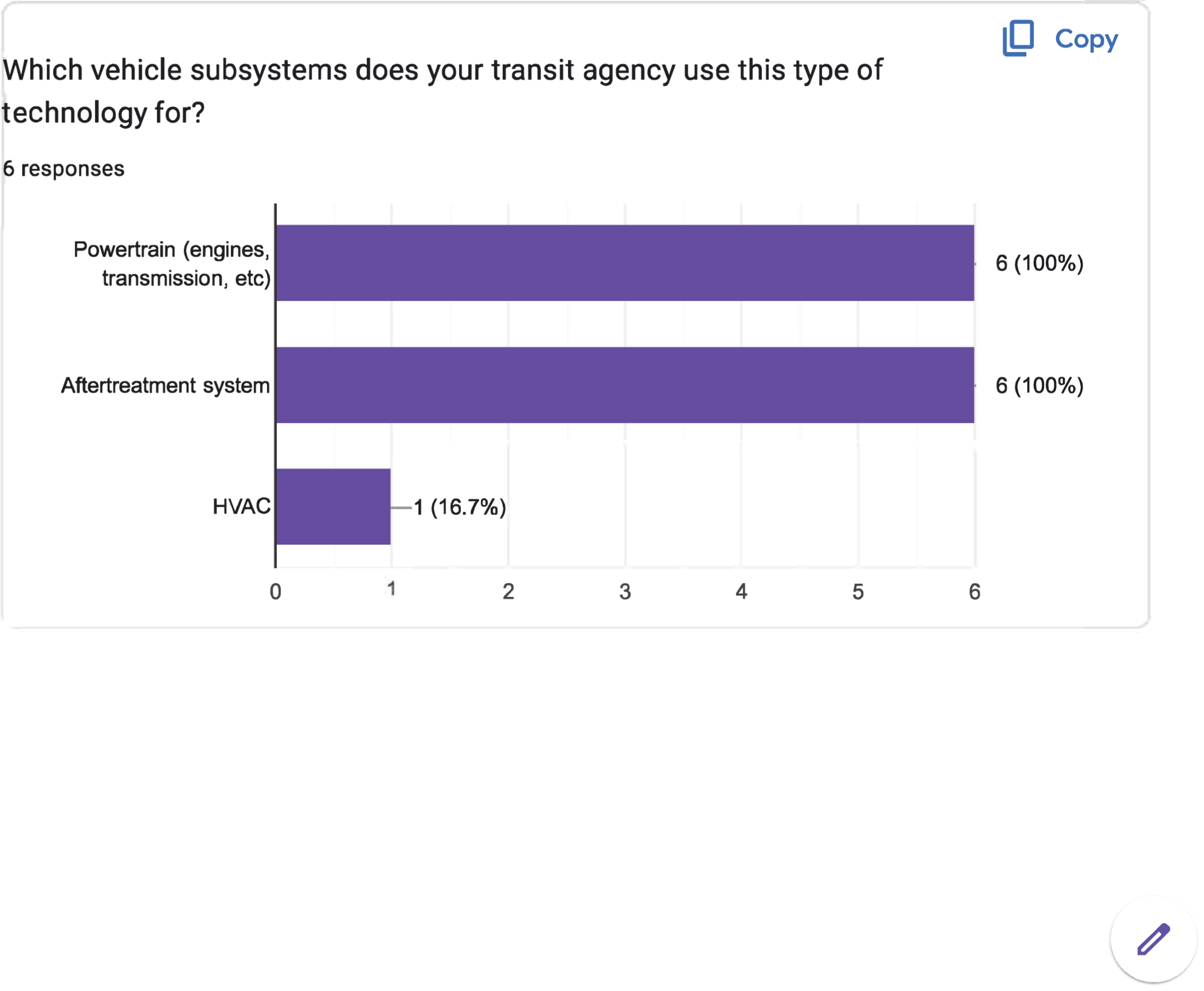
The horizontal axis shows the number of responses, ranging from 0 to 6 in increments of 1 unit. The vertical axis shows various vehicle subsystems. The bar graph displays data for 6 responses on the types of vehicle subsystems used by the technology. The data displayed are as follows: powertrain (engines, transmission, etc.) - 6 responses (100 percent); aftertreatment system - 6 responses (100 percent); and HVAC - 1 response (16.7 percent).

Long Description.
The horizontal axis shows the number of responses, ranging from 0 to 4 in increments of 1 unit. The vertical axis displays three functions. The bar graph displays data for 5 responses on the functions of the technology. The data displayed are as follows: alarms of faults or critical failures (for example, temperature, pressure, etc.) of a vehicle: 2 responses (40 percent); collection and presentation of vehicle or subsystem performance or sensor data: 3 responses (60 percent); and prediction of likely failures: 4 responses (80 percent).
Long Description.
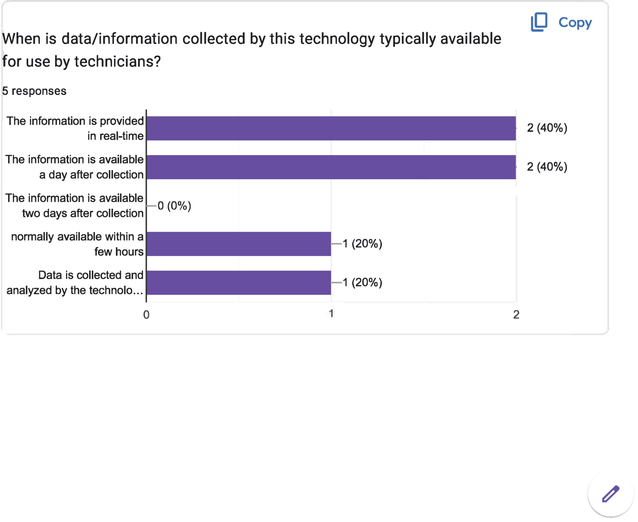
The horizontal axis shows the number of responses, ranging from 0 to 2 in increments of 1 unit. The vertical axis represents the timing of information availability. The bar graph displays data for 5 responses on the information collected by the technology made available to the technicians. The data displayed are as follows: the information is provided in real-time - 2 responses (40 percent); the information is available a day after collection - 2 responses (40 percent); the information is available two days after collection - 0 responses (0 percent); normally available within a few hours - 1 response (20 percent); and data is collected and analyzed by the technology - 1 response (20 percent).
Long Description.
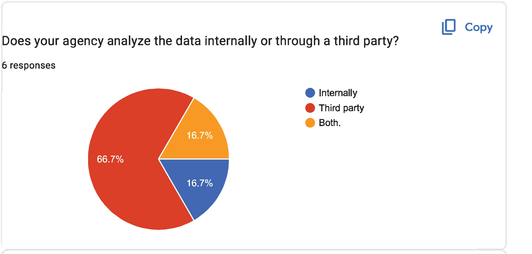
The sections in the pie chart represent Internally in blue, Third party in red, and Both in yellow. The pie chart shows 6 responses for the data analysis. The data shown are as follows: Blue: 16.7 percent. Red: 66.7 percent. Yellow: 16.7 percent.
Long Description.
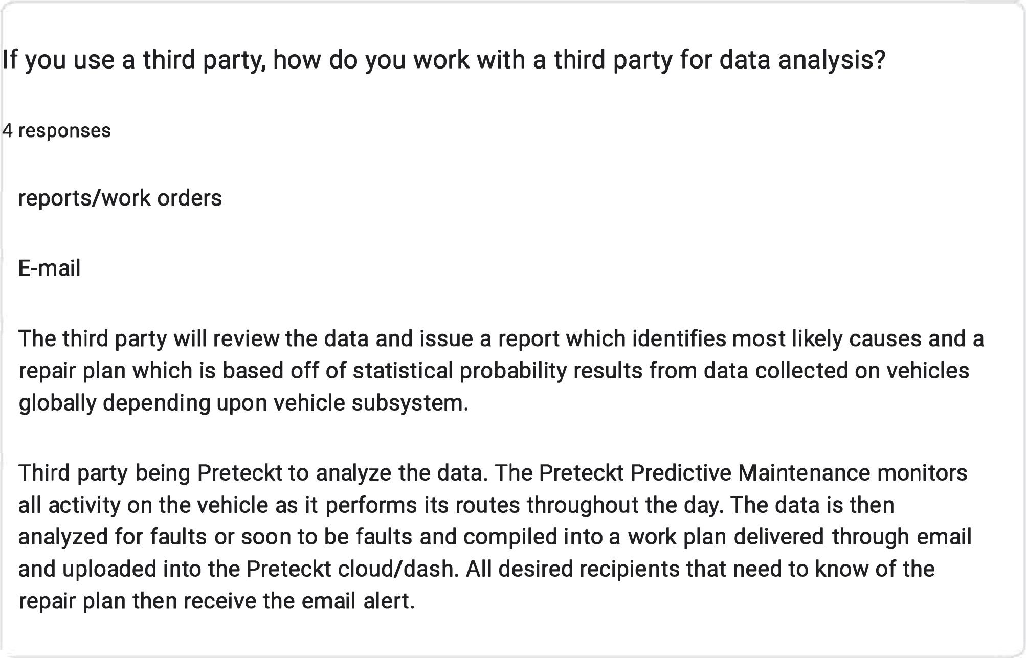
There are four responses: 'Reports or work orders.' 'Email.' 'The third party will review the data and issue a report which identifies most likely causes and a repair plan which is based on statistical probability results from data collected on vehicles globally, depending upon vehicle subsystem.' 'Third party being Preteckt to analyze the data. The Preteckt Predictive Maintenance monitors all activity on the vehicle as it performs its routes throughout the day. The data is then analyzed for faults or soon-to-be faults and compiled into a work plan delivered through email and uploaded into the Preteckt cloud or dash. All desired recipients who need to know of the repair plan will then receive the email alert.'
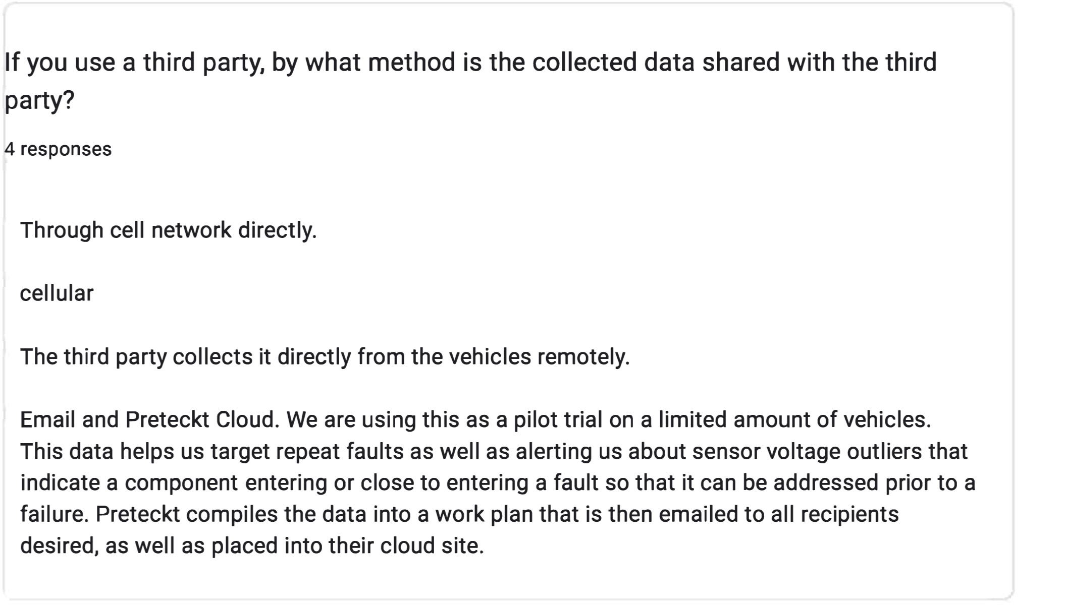
Long Description.
Four responses are listed. The first mentions direct sharing through cell networks. The second simply states 'cellular.' The third response indicates that the third party collects data directly from vehicles remotely. The fourth response details the use of Email and Preteckt Cloud in a pilot trial with a limited number of vehicles. This method helps target repeat faults and alerts about sensor voltage outliers, compiling data into a work plan for email distribution and cloud storage.
Long Description.
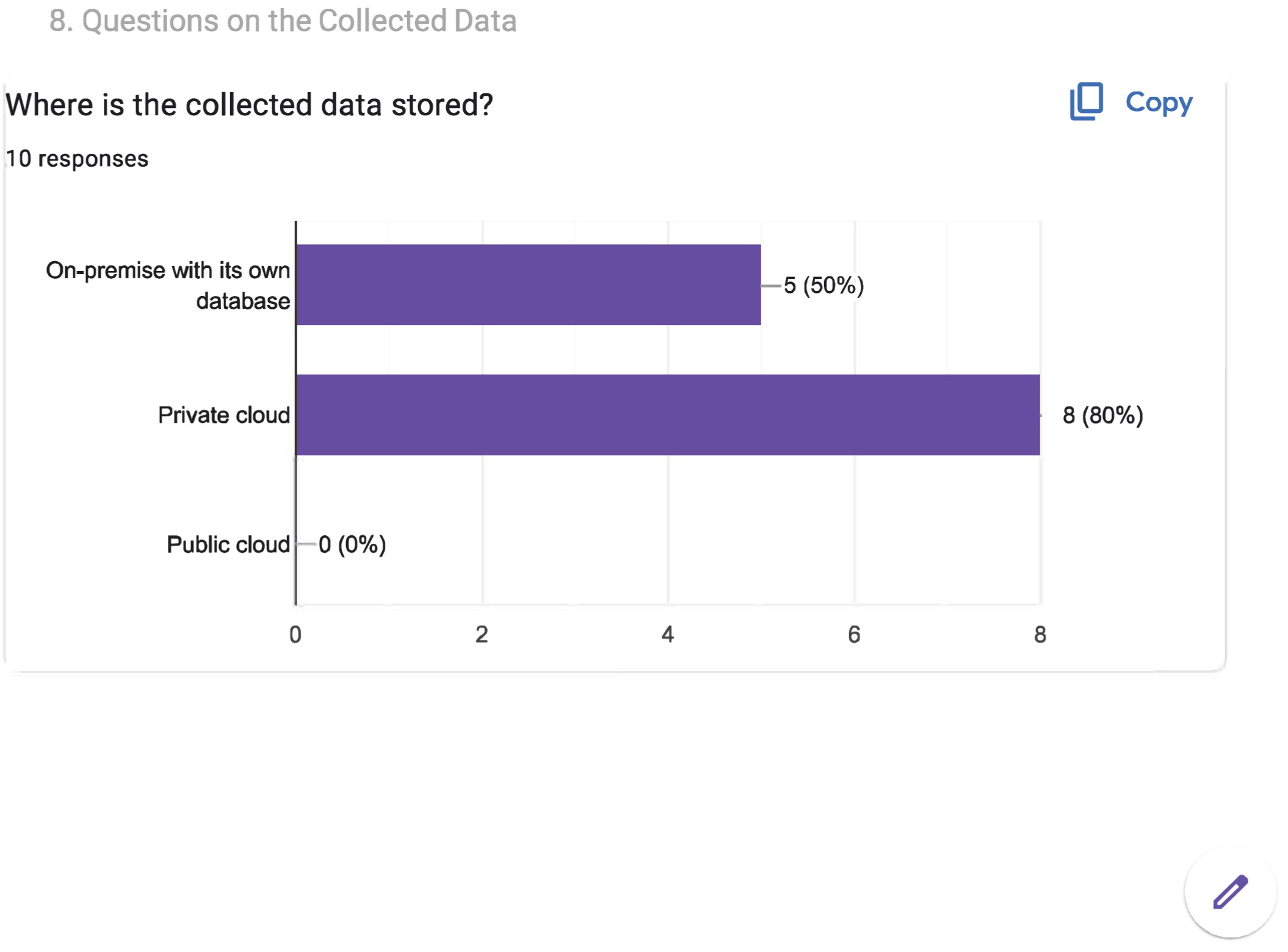
The question above the chart is ''Where is the collected data stored?' The horizontal axis shows the number of responses, ranging from 0 to 8 in increments of 2 units. The vertical axis lists three types of storage. The bar graph shows data for the storage of collected data for 10 responses. The data displayed is as follows: On-premise with its own database: 5 responses (50 percent). Private cloud: 8 responses (80 percent). Public cloud: 0 responses (0 percent).
Long Description.
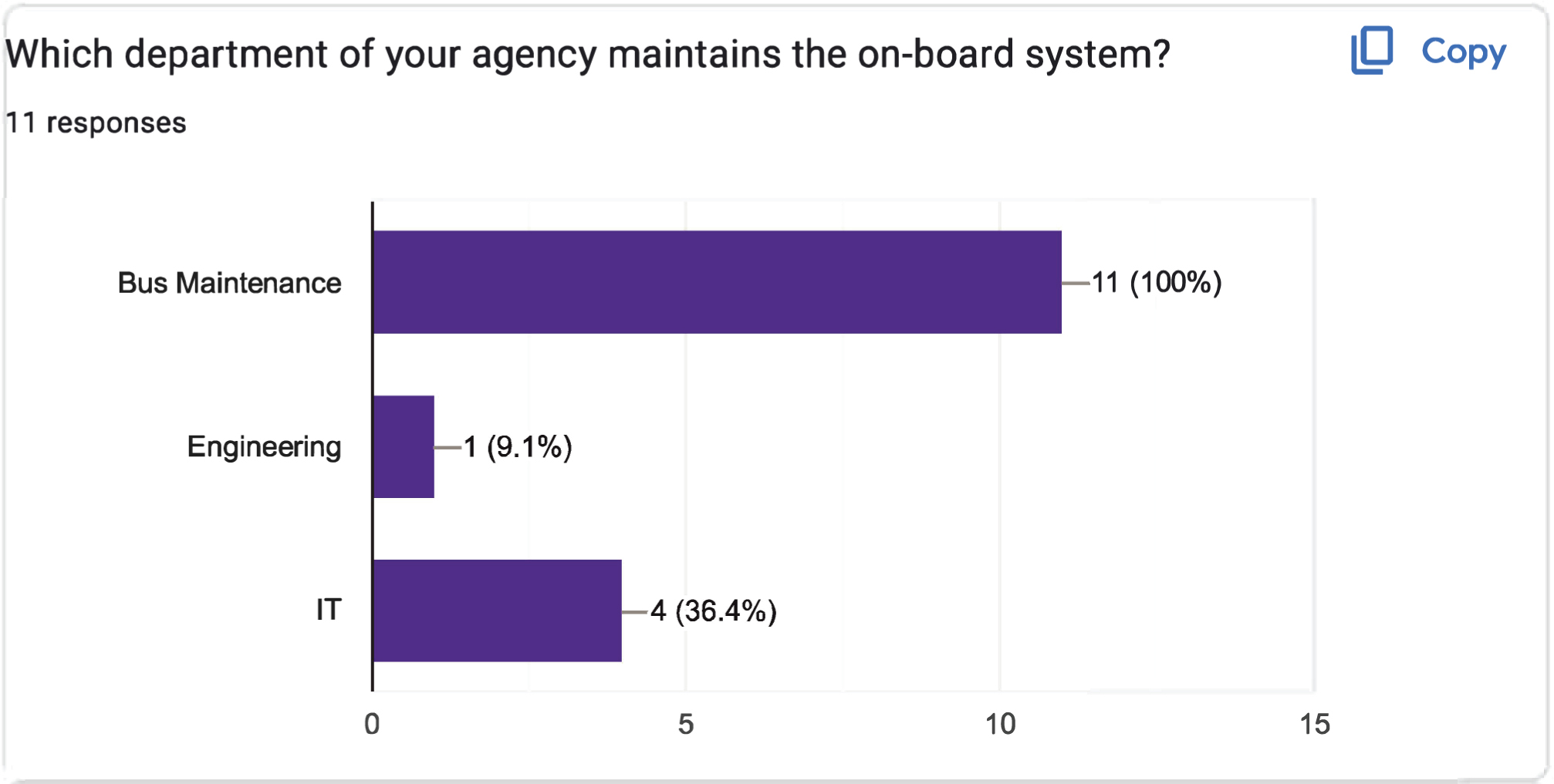
The horizontal axis shows the number of responses, ranging from 0 to 15 in increments of 5 units. The vertical axis lists three types of maintenance. The bar graph shows data for the maintenance of the onboard system for 11 responses. The data displayed is as follows: IT: 4 responses (36.4 percent). Engineering: 1 response (9.1 percent). Bus maintenance: 11 responses (100 percent).
Long Description.
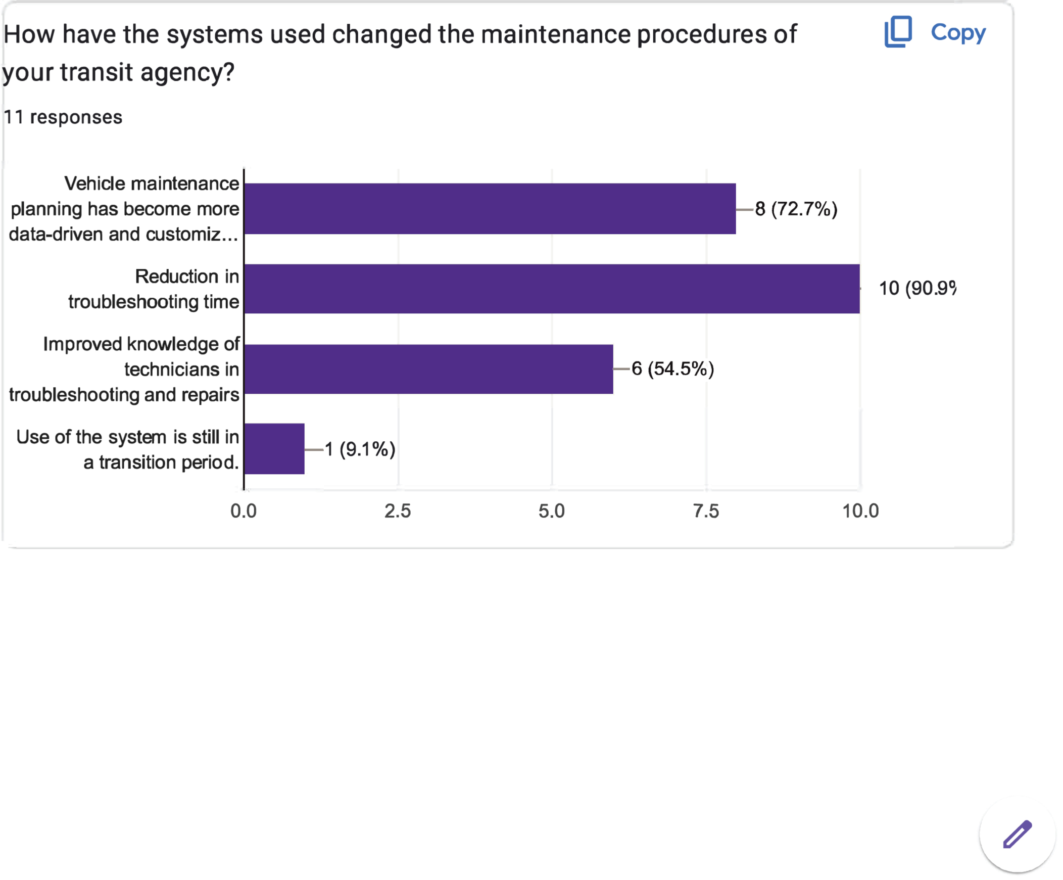
The horizontal axis shows the number of responses, ranging from 0.0 to 10.0 in increments of 2.5 units. The vertical axis lists four types of maintenance changes. The bar graph shows data for changes in the maintenance procedure for 11 responses. The data displayed is as follows: Use of the system is still in a transition period: 1 response (9.1 percent). Improved knowledge of technicians in troubleshooting and repairs: 6 responses (54.5 percent). Reduction in troubleshooting time: 10 responses (90.9 percent). Vehicle maintenance planning has become more data-driven and customized: 8 responses (72.7 percent).

Long Description.
The horizontal axis shows the number of responses, ranging from 0.0 to 10.0 in increments of 2.5 units. The vertical axis represents the perceived benefits of the system. The bar chart contains 10 responses. The data displayed are as follows: Reduction in overall vehicle downtime for diagnostics: 1 response (10 percent). Lower lifecycle costs for vehicles: 2 responses (20 percent). Longer vehicle useful lives: 4 responses (40 percent). More efficient use of maintenance resources: 10 responses (100 percent). Increase in mean distance between failures (MDBF): 7 responses (70 percent). Reduction in mechanical service interruptions: 7 responses (70 percent).
Long Description.
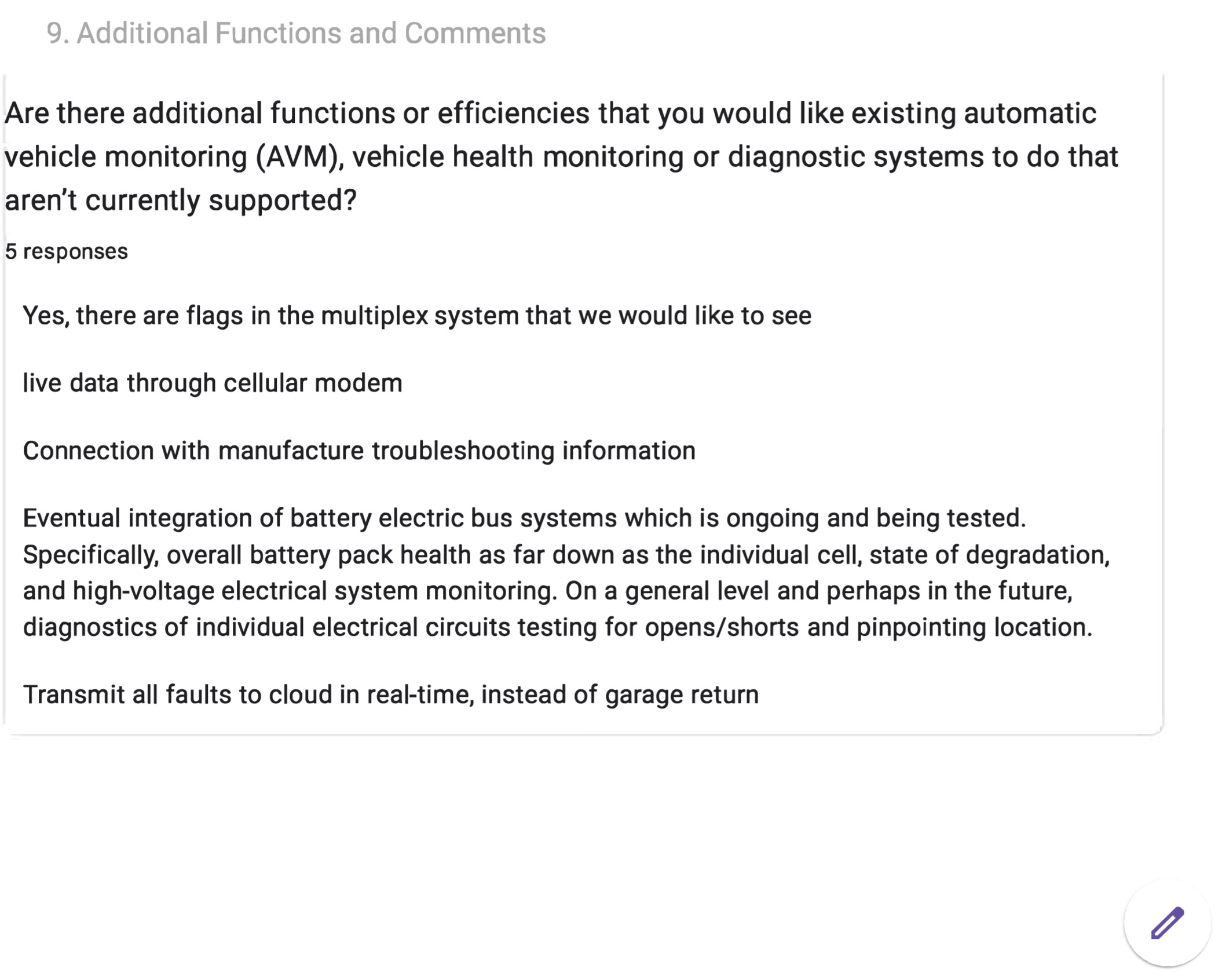
The screenshot begins with the question, 'Are there additional functions or efficiencies that you would like existing automatic vehicle monitoring (AVM), vehicle health monitoring, or diagnostic systems to do that aren't currently supported?' It includes five responses and lists the following: Yes, there are flags in the multiplex system that we would like to see. Live data through a cellular modem. Connection with the manufacturer's troubleshooting information. Eventual integration of battery electric bus systems, which is ongoing and being tested. Specifically, overall battery pack health as far down as the individual cell, state of degradation, and high-voltage electrical system monitoring. On a general level and perhaps in the future, diagnostics of individual electrical circuits testing for opens or shorts, and pinpointing the location. Transmit all faults to the cloud in real-time, instead of garage return.
Long Description.
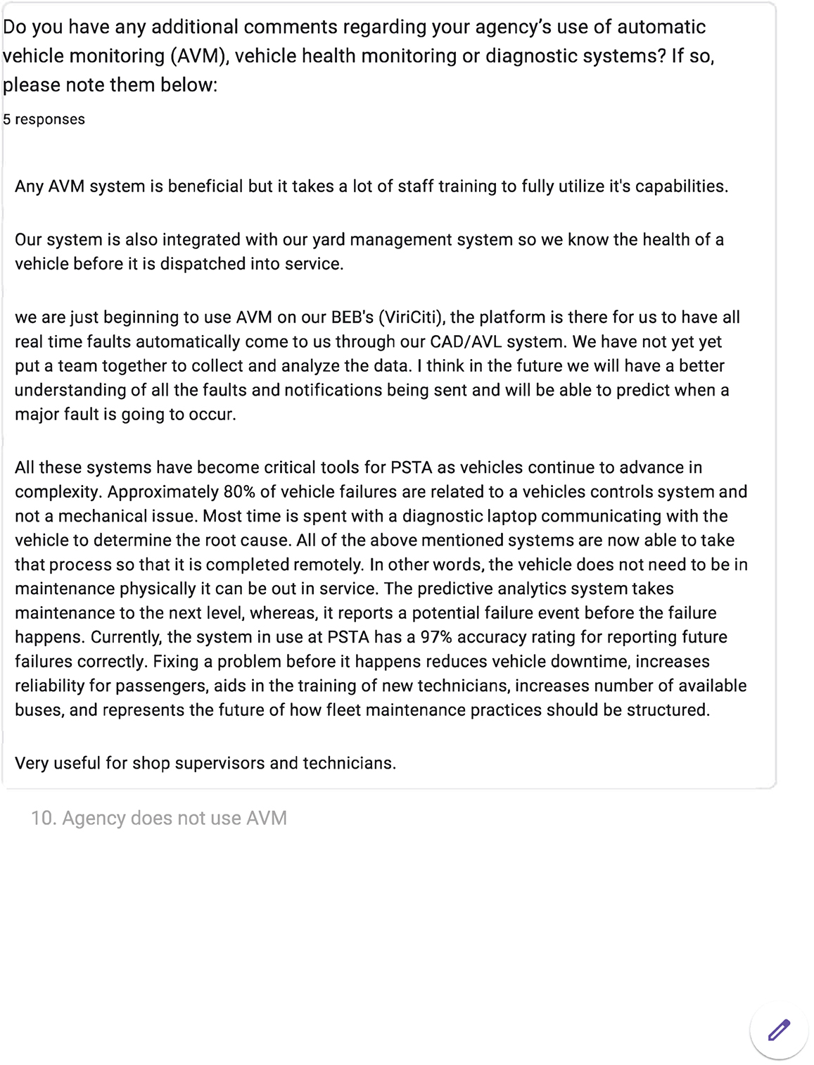
The screenshot begins with a question: 'Do you have any additional comments regarding your agency's use of automatic vehicle monitoring (AVM), vehicle health monitoring, or diagnostic systems? If so, please note them below.' It includes five responses and lists the following: Any AVM system is beneficial, but it takes a lot of staff training to fully utilize its capabilities. Our system is also integrated with our yard management system, so we know the health of a vehicle before it is dispatched into service. We are just beginning to use AVM on our BEB's (ViriCiti). The platform is there for us to have all real-time faults automatically come to us through our CAD or AVL system. We have not yet put a team together to collect and analyze the data. I think in the future we will have a better understanding of all the faults and notifications being sent, and we will be able to predict when a major fault is going to occur. All these systems have become critical tools for PSTA as vehicles continue to advance in complexity. Approximately 80 percent of vehicle failures are related to a vehicle's control system and not a mechanical issue. Most time is spent with a diagnostic laptop communicating with the vehicle to determine the root cause. All of the above-mentioned systems are now able to take that process so that it is completed remotely. In other words, the vehicle does not need to be in maintenance; it can be out in service. The predictive analytics system takes maintenance to the next level, as it reports a potential failure event before the failure happens. Currently, the system in use at PSTA has a 97 percent accuracy rating for reporting future failures correctly. Fixing a problem before it happens reduces vehicle downtime, increases reliability for passengers, aids in the training of new technicians, increases the number of available buses, and represents the future of how fleet maintenance practices should be structured. Very useful for shop supervisors and technicians. Below this is the text '10. Agency does not use AVM.'
Long Description.
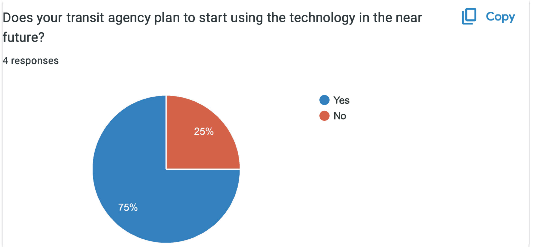
The pie chart is divided into two sections. The data are Yes: 75 percent. No: 25 percent. A total of 4 responses are noted.
Long Description.
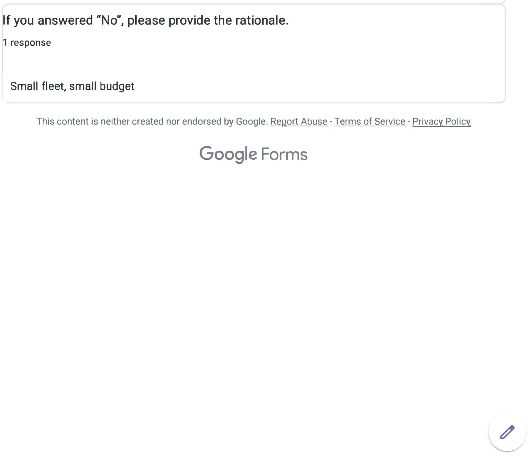
There is 1 response: 'Small fleet, small budget.'
This page intentionally left blank.
Abbreviations and acronyms used without definitions in TRB publications: |
|
A4A |
Airlines for America |
AAAE |
American Association of Airport Executives |
AASHO |
American Association of State Highway Officials |
AASHTO |
American Association of State Highway and Transportation Officials |
ACI–NA |
Airports Council International–North America |
ACRP |
Airport Cooperative Research Program |
ADA |
Americans with Disabilities Act |
APTA |
American Public Transportation Association |
ASCE |
American Society of Civil Engineers |
ASME |
American Society of Mechanical Engineers |
ASTM |
American Society for Testing and Materials |
ATA |
American Trucking Associations |
CTAA |
Community Transportation Association of America |
CTBSSP |
Commercial Truck and Bus Safety Synthesis Program |
DHS |
Department of Homeland Security |
DOE |
Department of Energy |
EPA |
Environmental Protection Agency |
FAA |
Federal Aviation Administration |
FAST |
Fixing Americaʼs Surface Transportation Act (2015) |
FHWA |
Federal Highway Administration |
FMCSA |
Federal Motor Carrier Safety Administration |
FRA |
Federal Railroad Administration |
FTA |
Federal Transit Administration |
GHSA |
Governors Highway Safety Association |
HMCRP |
Hazardous Materials Cooperative Research Program |
IEEE |
Institute of Electrical and Electronics Engineers |
ISTEA |
Intermodal Surface Transportation Efficiency Act of 1991 |
ITE |
Institute of Transportation Engineers |
MAP-21 |
Moving Ahead for Progress in the 21st Century Act (2012) |
NASA |
National Aeronautics and Space Administration |
NASAO |
National Association of State Aviation Officials |
NCFRP |
National Cooperative Freight Research Program |
NCHRP |
National Cooperative Highway Research Program |
NHTSA |
National Highway Traffic Safety Administration |
NTSB |
National Transportation Safety Board |
PHMSA |
Pipeline and Hazardous Materials Safety Administration |
RITA |
Research and Innovative Technology Administration |
SAE |
Society of Automotive Engineers |
SAFETEA-LU |
Safe, Accountable, Flexible, Efficient Transportation Equity Act: A Legacy for Users (2005) |
TCRP |
Transit Cooperative Research Program |
TEA-21 |
Transportation Equity Act for the 21st Century (1998) |
TRB |
Transportation Research Board |
TSA |
Transportation Security Administration |
U.S. DOT |
United States Department of Transportation |

Transportation Research Board
500 Fifth Street, NW
Washington, DC 20001